Eight
September 2014
Just as forScore's original look and feel evolved over the course of three years into a cohesive, refined experience, forScore 8 continued this process for the second design era of flat, layered interfaces.
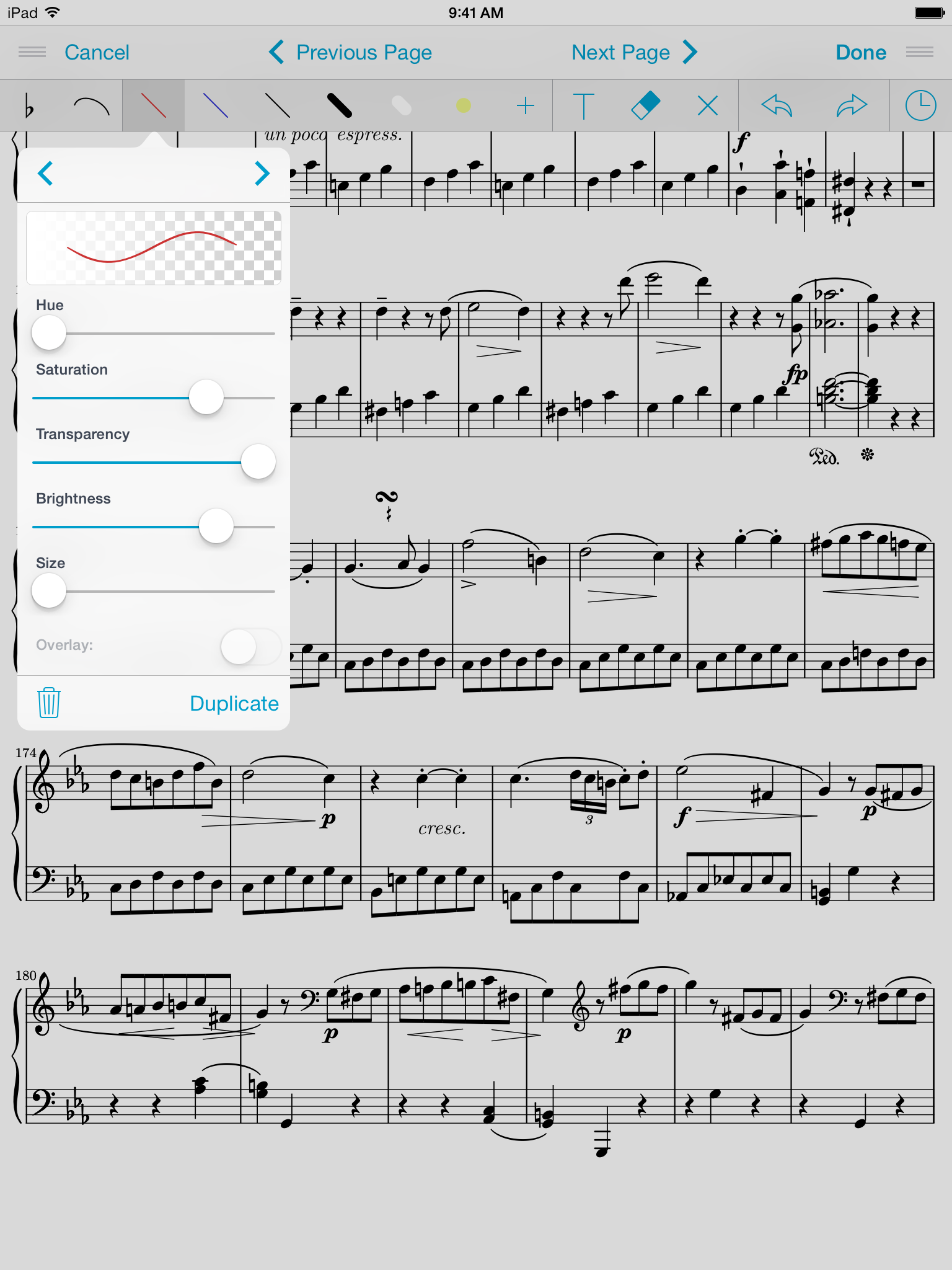
The first target was forScore's annotation controls, which had remained largely the same since version 2.2. By reducing the number of panels and popovers and by arranging the drawing tools into clearly defined spaces, we were able to reduce the number of taps required to annotate effectively without sacrificing visual clarity.
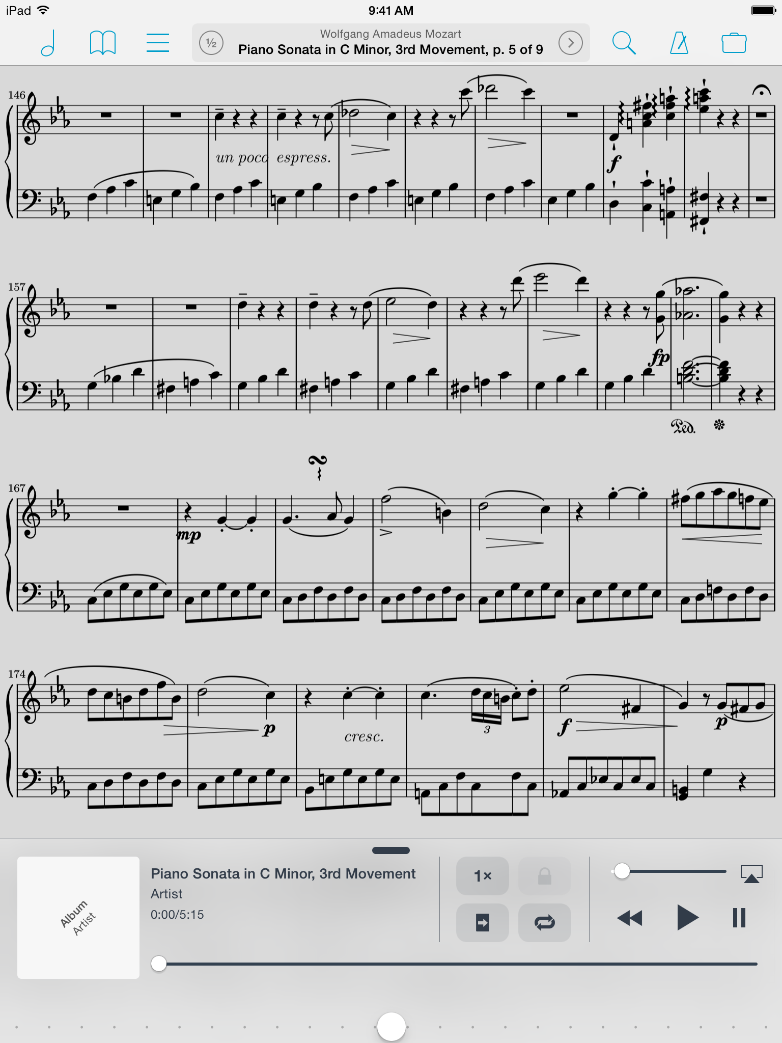
The audio control panel also got its first major rewrite, featuring an edge-to-edge design that uses layering instead of excess margins to create visual delineation.
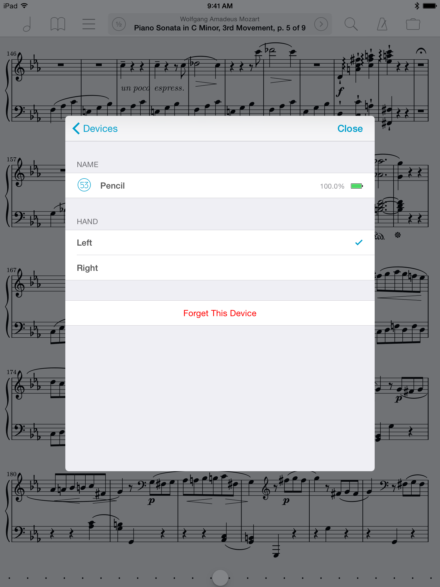
For many musicians, a Bluetooth page turner is a must. So when Bluetooth Smart devices started coming to market, we knew immediately that this would benefit our users. Although we had created the infrastructure much earlier on, it wasn't until devices like the iRig Blueboard and FiftyThree Pencil grew in popularity that we could jump in and take advantage of their unique capabilities.
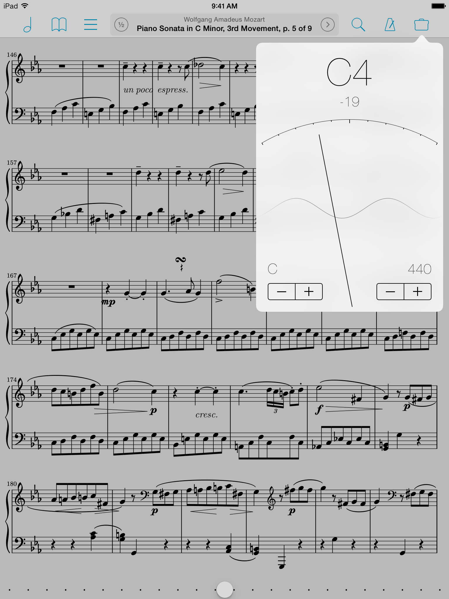
We also added a tuner to our musician's toolbox, but the most important new addition in forScore 8 was Reflow, a powerful technology that scans pages of music for individual systems and then magnifies and lays them out end-to-end like a horizontal teleprompter. It was unlike anything we had ever attempted to do before and, like the Devices panel, it was in development for some time before we felt ready to unveil it. The results have been incredible, and we're working hard to find even more ways to reduce barriers between musicians and their music.
Version eight's progress continues today with Groups, a service that leverages Apple's new CloudKit technologies to automatically share a musician's scores and setlists with their colleagues.
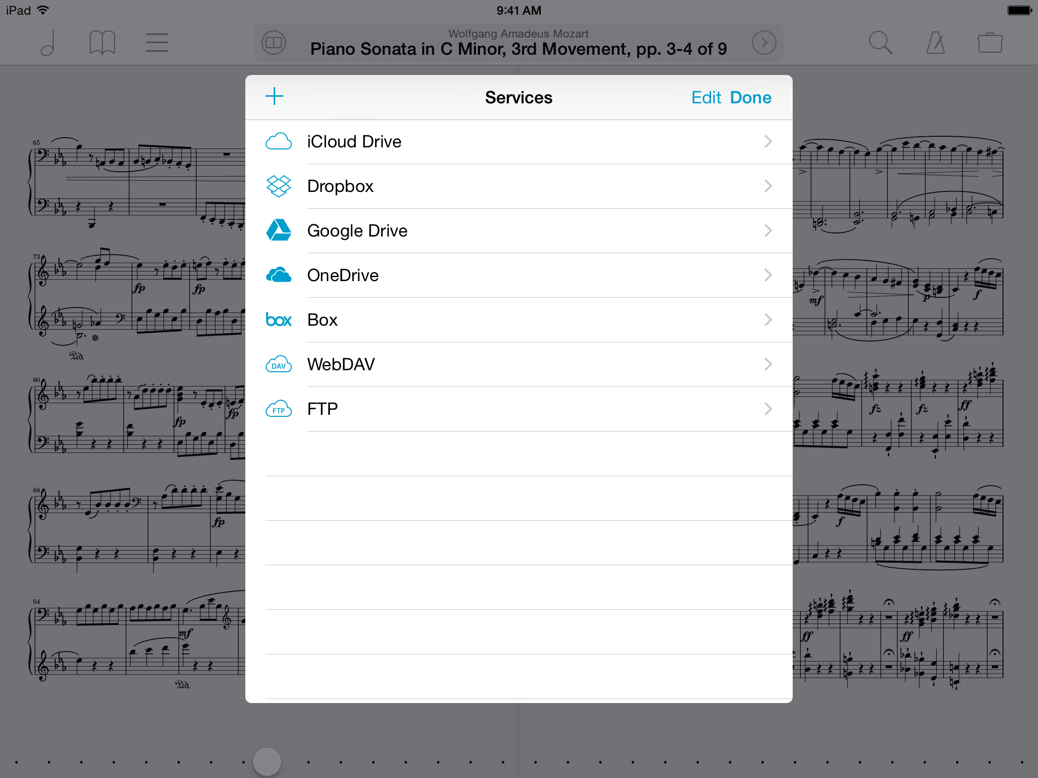 iCloud Drive joined the list of available cloud storage services