Beyond
The next ten
To simply reach this milestone is an honor. Our success was hardly inevitable, but it was earned through years of hard work and a refusal to give up. We wrote the code, made the tough calls, and agonized over our designs, but our customers were the fuel. You took part, invested in us, and you were helpful, patient, and honest when we missed the mark. As always, thank you.
Ten years from now, we hope to be right back here, with even more chapters, successes, leaps, missteps, and laughs. No one can say where the technology will lead us, but one thing will always be true: we will continue to dedicate our efforts to removing barriers between musicians and their music, and we will work tirelessly to make forScore the best app it can be.
And now, if you're brave enough to take a look, we leave you with a glimpse at a few of the designs and ideas that just didn't make the cut over the years:
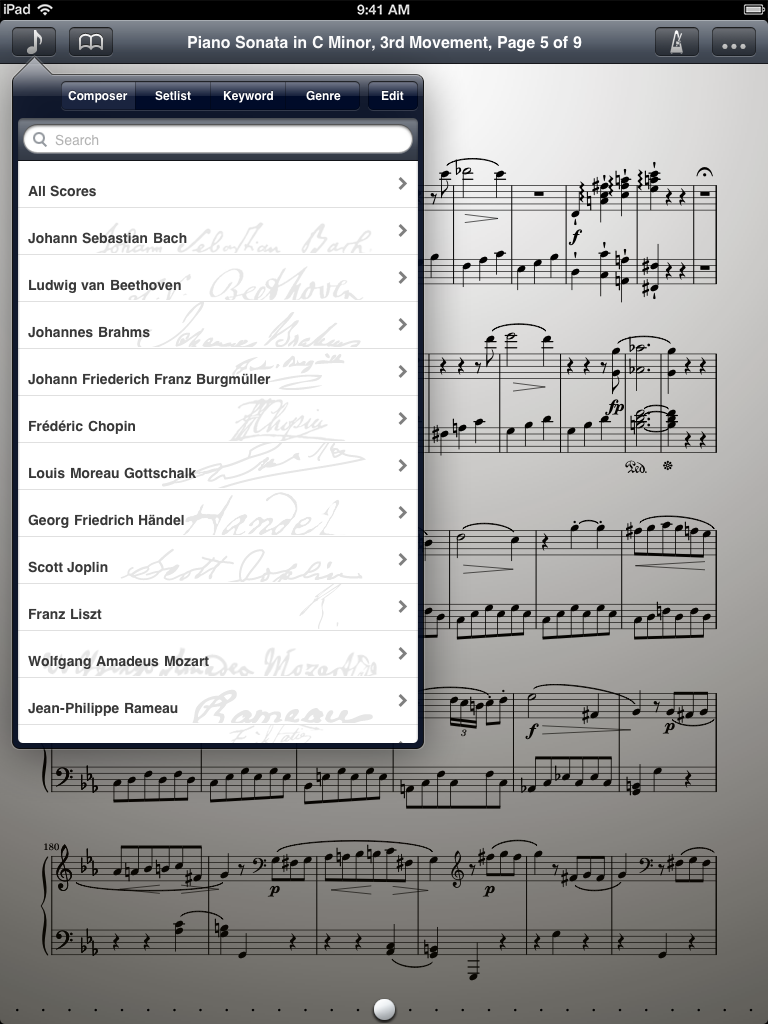 Moving the menu's segmented control into the navigation bar saved vertical space but compromised usability
 Our first attempt at customizing popovers (the arrow wasn't implemented before we abandoned this design)
 Trying to match that popover color was a constant headache and unnecessary restriction...
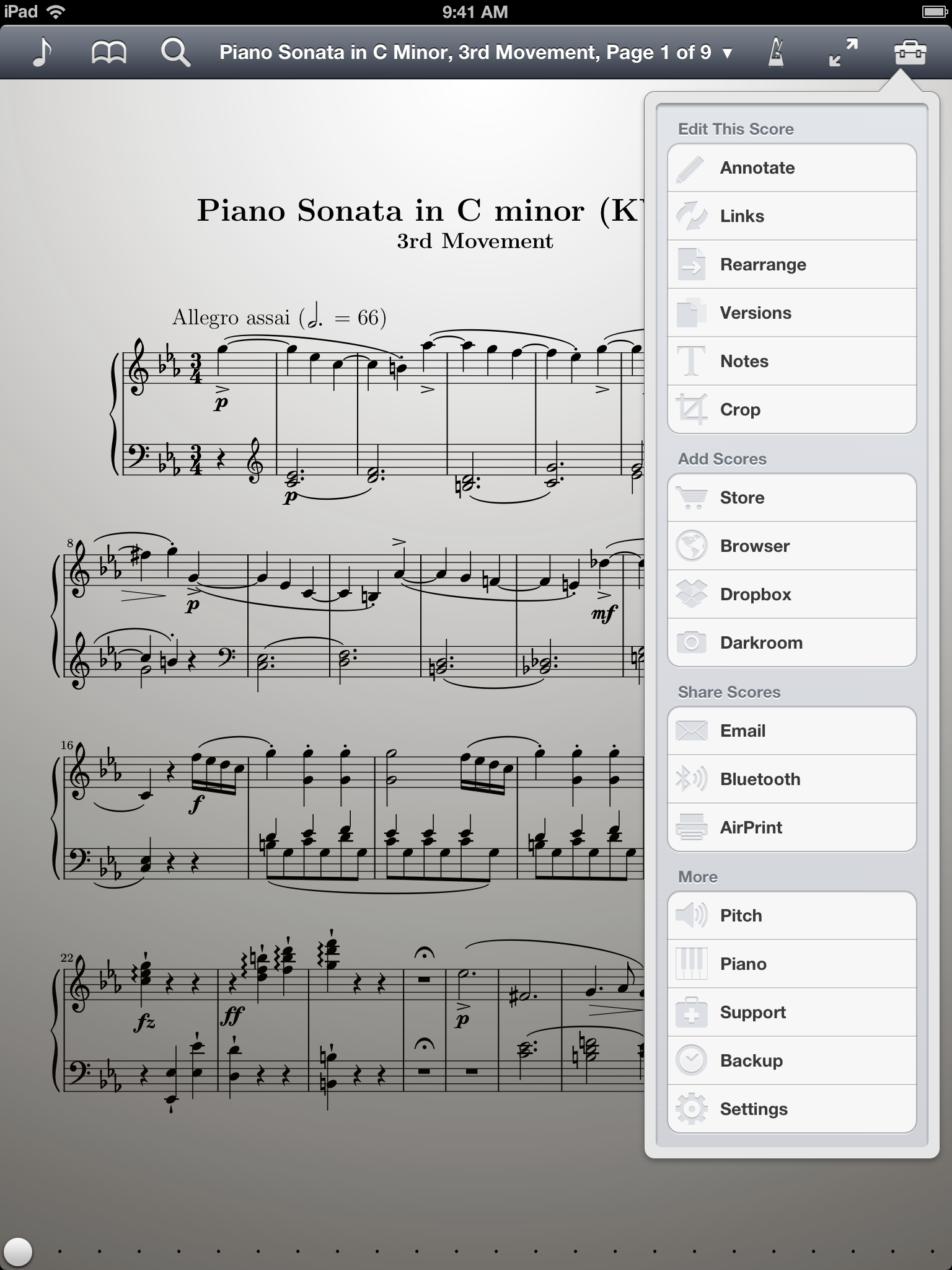 ...and we tried a few different styles before settling on a custom popover design for version 5.0
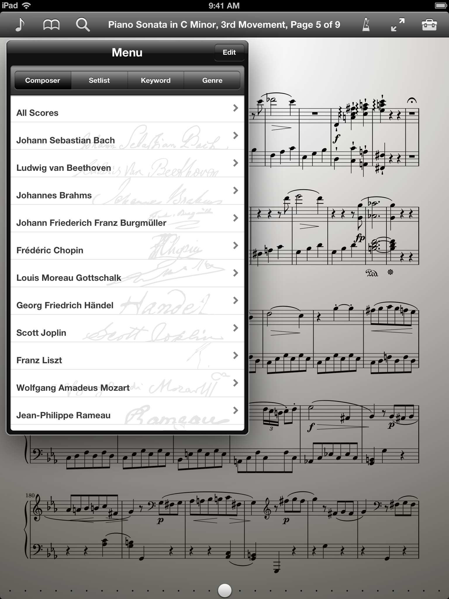
 Upright tabs made sense logically, but the controls lost their defined space and animated awkwardly
 It wasn't a bad look, but it didn't work for the menus and the results would've been less cohesive overall
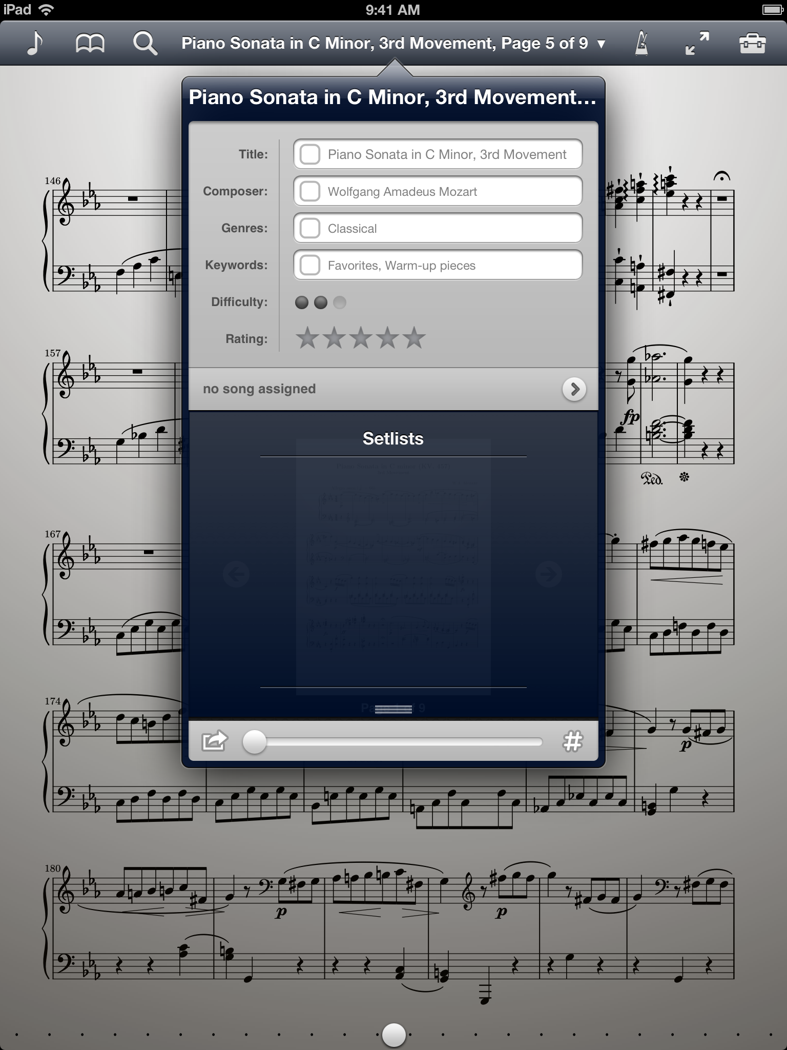
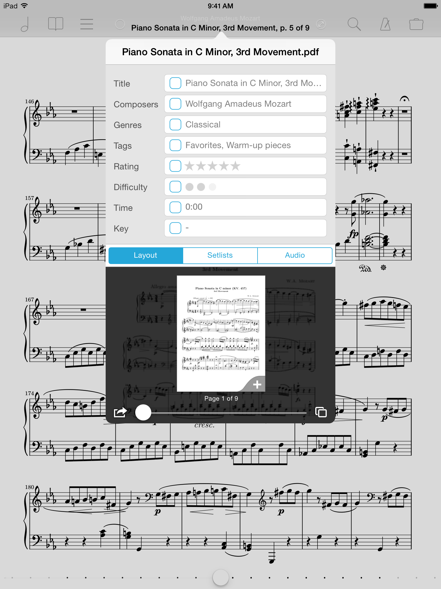 Unnecessary layering and inconsistent perspective made this metadata panel concept too distracting
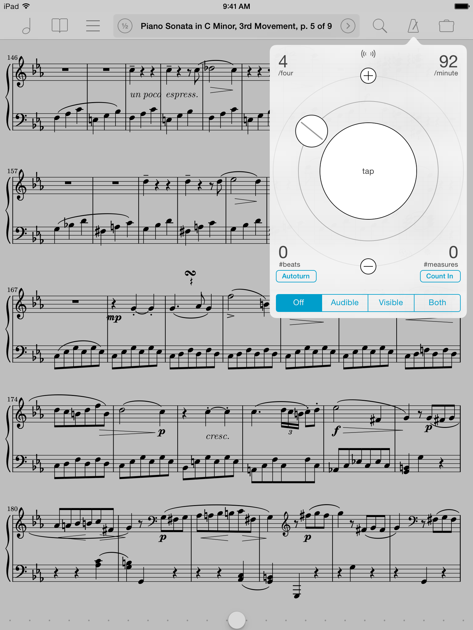 The atomically-inspired metronome was just a little too intense
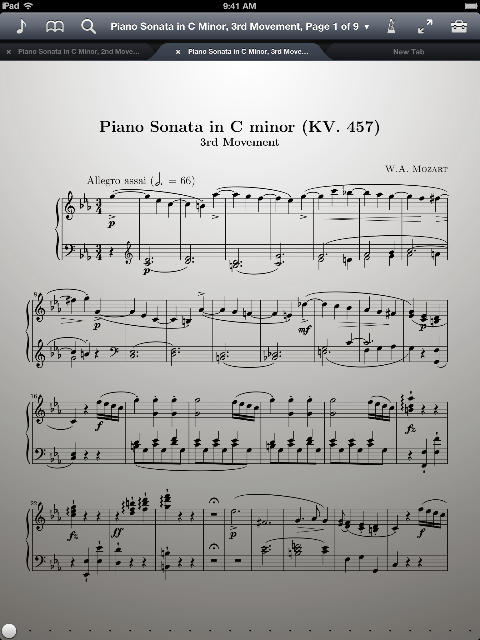
 Although it's a more efficient use of space, the grid view just made it harder to find things