Menus
When you’re not viewing a page of music, the most common type of view you’ll be using in forScore is a menu, or a list of items. You’ll learn about specific menus later in this guide, but there are a few important concepts that apply equally to most of the app’s menus.
Layout
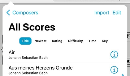
Menus usually feature a navigation bar along the top. This bar includes a title, a back button (when appropriate), a menu button which lets you change how items are sorted or presented, and an edit button. On iPhones or in other cases where space is limited, some of these buttons may appear in a toolbar along the bottom of the menu instead.
The menu (ellipsis) button lets you sort lists differently, show some lists as a grid of thumbnails, and may also offer a Filter function that allows you to only show items in the current list that match one or more rules that you define.
Below the navigation bar, you’ll usually see a segmented control that changes which content you see in the menu. This control may scroll horizontally if needed to display all of the options.
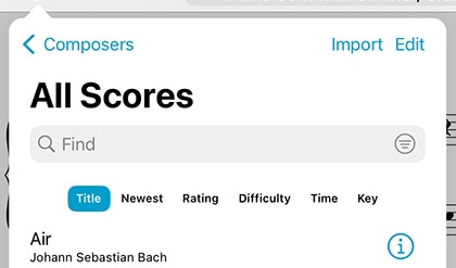
Most menus also include a search bar hidden between the navigation bar and the segmented control—drag the list downward to access it. When you’re done searching, or when you scroll, the search bar slides back under the navigation bar and disappears until you need it again.
Menus may also include an index down the right-hand side which allows you to move quickly through longer lists. Tap or drag your finger up and down over it to jump to a particular spot or first letter (if the list is sorted alphabetically).
Working With Lists
To open an item, just tap on it. Some lists feature swipe actions so you can do common things quickly: swipe from right to left over an item to reveal actions such as Share or Delete. In many cases, you can also tap and hold an item (or right click) to see a complete list of actions available for that item.
You may also see a button or symbol off to the right-hand side of each item. A light gray arrow or chevron symbol indicates that selecting the row will display an additional list of items, such as selecting a composer to see all of their scores. A circular colored button lets you edit an item, while tapping anywhere else in that row opens the item instead.
One of the most important items in a menu is the edit button in the navigation bar or toolbar. While in edit mode, you can tap to check or uncheck multiple items in the list and then use the chevron button in the navigation bar to work with those files in a number of ways. These options can vary, but usually include the ability to select or de-select all items and delete or share them.
Sidebar
In some cases, forScore uses a sidebar to present many of its menus. It uses one of two styles: overlay or tile (tap the Sidebar button in the toolbar along the bottom of the menu to switch between these modes). Overlay dims the page and only allows you to access the menu—tap the dimmed area to dismiss it. In tiled mode, you can work with menus and the main view at the same time. Note that when the window is too small to use tiled mode, it switches back into overlay mode automatically. This sidebar layout is used on macOS, visionOS, and can be toggled using the Display Options overlay on supported iPads.

