About forScoreMusic
Power
Performance
Design
Tools
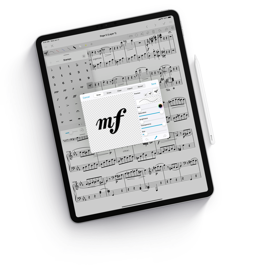
Deliberately clear, deceptively powerful.
The Perfect Fit
For us, it’s everything. What the app looks like, how it works, how you work with it, how we can keep things simple and clear—user experience is more than just a tagline, it’s the whole point. From the smallest iPhone to the highest resolution desktop displays, every part of the interface adapts without deferring to the lowest common denominator. It takes advantage of space when it has it, and uses an intuitive hierarchy to make the most of every pixel when needed.
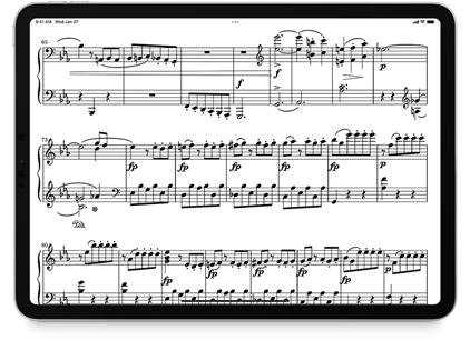
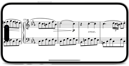
Landscape
Turn your device sideways to get a better view of your music. Tap on the right to scroll down, and tap again to turn the page.
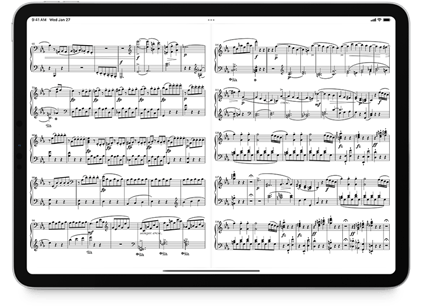
Two-up View
If you prefer, you can also view two pages side by side. It’s perfect for devices with larger screens.
Multitasking
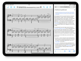
Split View
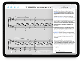
If your iPad supports it, use forScore and another app side by side. Our adaptive interface handles it all, making the most of however much space you give it.
Slide Over
Get to another app with a quick swipe, and then jump back into forScore without skipping a beat. It’s perfect for those quick tasks you don’t want to forget to do.
Tabs
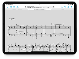
When you’re working with a few different scores or bookmarks at once, tabs make it easy to switch between them without losing your place.
Multiple Windows
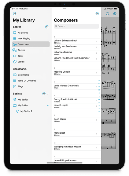
Multi-window support on iPadOS, macOS, and visionOS takes things to the next level. Designed from the ground up using the very latest technologies and standards, secondary windows combine a more streamlined interface with many of the powerful core features you’ll find in the primary app window like annotation, two-up mode, half-page turns, Reflow, and Face Gestures. You can also access tools like Links, Buttons, Rearrange, and Crop, or manage your library with full read-write functionality.
Windows are easy to create with drag and drop gestures on iPad, and support native tabbing behaviors on macOS so no matter which platform you’re using you’ll find everything you expect.
On iPadOS 16 things get even more interesting with full support for Stage Manager and the extended desktop experience offered while using an external display. In forScore’s main window, you can even switch to the same split view layout we’ve always used on macOS, and you can customize additional behaviors and interface elements to make working with an iPad more desktop-like than ever.

Made for Mac
Whether you’re browsing through your library, editing a setlist, or working with layers while annotating, forScore’s Mac sidebar lets you take full advantage of larger screens. Other standard system features like drag and drop, contextual menus, the menu bar, touch bar, and trackpad support mean forScore feels right at home on macOS. And with secondary windows featuring prominent toolbar support, along with all of the same great features described above, it’s a truly first-class native experience.
Accessibility
Reflow
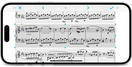
Sometimes you need a bigger view of your music, and Reflow is our revolutionary tool that automatically detects systems of music on each page of your standard PDF file and lays them out end to end like a horizontal teleprompter. Since your music is no longer bound by the width of your screen, you can zoom in (up to three times the music’s original size) and play naturally. Your links and annotations are fully supported, so you won’t miss a thing. If automatic detection gets something wrong, adjust Reflow’s zones once and never worry about it again.
Customization
We’re all a little different, and sometimes the way forScore works might not work for you. That’s why we’ve added accessibility options so you can change the app’s tint color, use fullscreen menus, change the size of Links and Buttons, and replace the metronome’s sounds. forScore also takes advantage of iOS’ dynamic text sizes whenever possible so you can set the size that works best for you.
Dark Mode
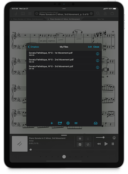
Use dark mode, light mode, or let the system switch automatically for you each day and night. No matter what you choose, forScore adapts seamlessly to either environment.
More than just a theme, forScore intelligently updates its views to maintain legibility at all times. Whether you’re using the app’s default tint color or you’ve customized it, forScore adjusts that color’s brightness without changing its hue so you can keep your preferred color without reducing contrast. Or, set two distinct colors for each mode for just the right look.
Let forScore match the system setting or override the app’s styling to always use dark or light mode. In dark mode, forScore can even dim the pages of your music so you can play more comfortably in low light without altering your music. If you prefer, use your device’s accessibility features to invert pages, annotations, and all.
It doesn’t just look great, dark mode is a perfect fit for a performance environment or late night session.