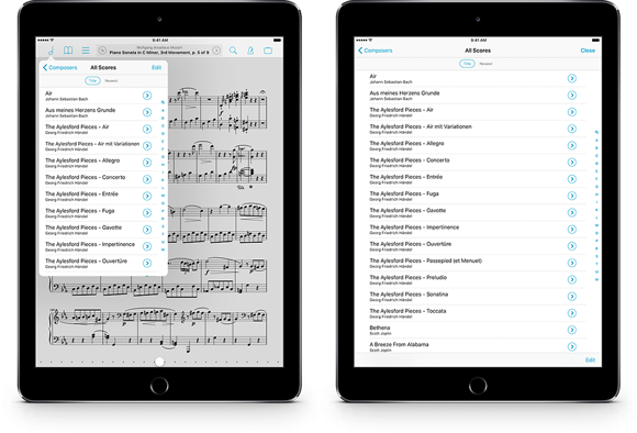
Fullscreen Menus
When you’re not playing music or annotating your scores, much of your time in forScore is likely spent working with menus that let you access and edit your scores, bookmarks, and setlists. These menus float above your score in the top left-hand corner of the screen, in what Apple calls Popovers. These popovers make sure you always know what you’re looking at and where it comes from, which is why they have arrows pointing to the button you tapped to open them. They also keep the rest of the control bar visible so you an do things like switch from the score menu over to the setlist menu with just one tap.
Popovers can be dismissed by tapping outside of them; this behavior works for most but some people find that they occasionally dismiss these menus accidentally. And, while most titles are short enough to fit into the default size of these menus, you may prefer to see as much information as possible and avoid unnecessary truncation. That’s why we’ve included an option called “fullscreen menus” in the “accessibility” section of forScore’s settings panel. If you enable it, these menus will take up the whole screen, preventing accidental dismissal and giving you the biggest possible view of your library and setlists.
