iPad Pro Updates
It’s been about a month now since Apple unveiled their latest generation of iPad Pros, so today we wanted to detail some of the impact that these devices’ unique characteristics has had on forScore and what effect it will have as we look to the future.
Aspect Ratio
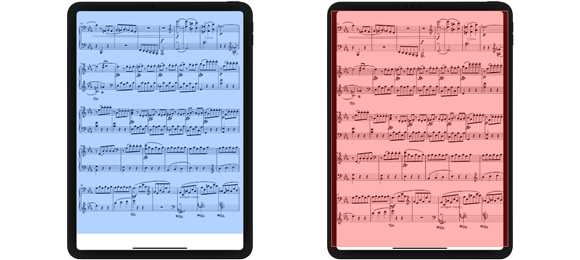
The most important change Apple made to this round of iPads is that they changed the aspect ratio of their screens. The 11″ iPad Pro is taller and skinnier in portrait orientation, or squatter and wider in landscape. The 12.9″ iPad Pro’s screen has the same dimensions as previous generations, but the addition of the home indicator area along the bottom of the screen has its own implications: apps can display roughly the same amount of information on screen, but a strip along the bottom of the screen is non-interactive—touches that you make in this zone are reserved for system gestures like returning to the home screen.
These changes are important because, until now, forScore has always run on devices with roughly the same proportional screen size. Unless you’re using Split View, the app’s usable screen area is usually equivalent to an 8.5×11″ piece of paper. PDF pages are rendered within that area, with gaps added to the left and right if needed (for skinnier pages like A4) or below the bottom of the page (as with landscape-oriented pages). Regardless of how much visible area your page occupies on screen, forScore has always allowed you to annotate anywhere on the screen so your markings don’t suddenly stop working when you move past invisible page boundaries.
Now, forScore runs on two unique devices: one that has more space at the bottom and another that has the same amount of visible space but less interactive space.
Challenges
When your device is held in portrait orientation, forScore displays full pages and allows you to flip through them with a single tap or swipe. In landscape orientation, forScore increases the size of the page to fit the longer edge of your screen and navigation adapts to allow for scrolling up and down as needed before turning pages. iOS 9’s multitasking modes make things a little more complicated, so forScore considers “portrait” to be any app size that allows it to display a full page without cutting off the bottom, while “landscape” is the opposite.
The first problem we encountered in updating forScore for these new devices was that the screen size of the 12.9″ iPad Pro, minus the area required for the new home indicator, meant that forScore assumed traits normally intended for landscape orientation even when the device was held in portrait orientation. Tapping to turn the page scrolled up or down by a tiny amount, and two-up mode inappropriately replaced half-page turns. On this device forScore can display a full page but the app’s interactive space is slightly smaller than what’s expected. So we added an exemption in forScore 10.5, and another in 10.5.2 for users with iOS’ Display Zoom feature enabled.
On the 11″ iPad Pro, a side effect of the screen’s aspect ratio change is that, when in landscape orientation, scrolling from the top of the page to the bottom leaves very little overlap and may not display each system of music fully. In forScore 10.5.2, we added a setting that’s specific to this device so you can choose whether forScore scrolls by half or by a third of a page.
Another change new iPad Pro owners quickly noticed was that iOS displays its home indicator at all times, potentially obscuring a very small portion of the bottom of your page if you’re using a 12.9″ iPad Pro. While iOS doesn’t allow developers to access or modify this indicator in any way, it does allow apps to declare that they prefer the indicator bar be hidden if possible. As of version 10.5.2, forScore does exactly that. When the home indicator appears or disappears is entirely up to iOS, but generally if you’re not touching the screen the home indicator will now get out of your way so you get an unobstructed view of your music.
The Future
Soon after these new devices were released, we started getting questions from purchasers of the 11″ model who were confused by the fact that, in portrait orientation, forScore doesn’t use the full height of the screen to display pages. This has to do with aspect ratio: making a page taller stretches it and makes the music look wrong, and zooming in on a page cuts off the left and right sides of your music. Even if you’re using pages with skinnier aspect ratios (like A4 pages), the fact that forScore has always allowed you to annotate within a canvas equal to the original iPad screen’s dimensions means that zooming in could still obscure your notes, links, text annotations, and more.

A few customers who asked about this have followed up by asking if cropping could be handled differently: that forScore display pages just as it does on older devices, but that cropping be adapted to allow pages to get bigger on the screen. This presents its own challenges, however, such as when sharing these files with colleagues who might be using older devices, or when using iOS’ Split View. It gets incredibly complicated and tough to do in a thoughtful, natural, and reliable way.
As we look to the future, however, we absolutely understand that this is a downside for people hoping to get the most out of their new device’s large screens. All we can say now is that we’re exploring a variety of possible ways we can better work to the strengths of each new device. Just like we did with the Apple Pencil, we move from getting the basics working right before we press onward to determining how best to take full advantage of major shifts in Apple’s hardware. It takes a little bit of time to get right, and we appreciate your patience.