forScore 12Available Now
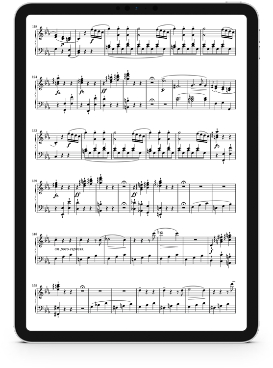
A whole new show.
Nothing is more important for a sheet music reader than displaying pages as clearly and effectively as possible. Everything starts with your music, plain and simple. So it’s time for a whole new foundation with a more dynamic approach to displaying your music that makes the most of every device’s screen size and provides the flexibility needed to fuel forScore for the next decade. It’s time to break out of those constraints once and for all. Introducing forScore 12, a whole new show.
Presentation
forScore’s page rendering and layout systems were built for screens with a 3:4 aspect ratio that’s very similar to common paper sizes. As forScore came to other devices with unique aspect ratios, forScore’s standardized canvas size ensured compatibility when sharing scores and edits with colleagues, but fell short of giving musicians the best possible view of each page of music.
forScore 12 debuts a completely new page layout engine that takes a different approach. It features three display modes: standard, best fit, or zoomed, allowing scores (like those that use the A4 size) to fill as much of your screen as possible without adding unnecessary gaps.
Just double tap the center of the page to see the new Display Options overlay, where you can also toggle half page turns, two-up mode, and the sepia effect.
Displays
Rewriting our layout engine wasn’t just about reducing margins, though—it was a key foundational improvement whose benefits will be realized for years to come.
For instance, we used this new engine to completely replace our legacy TV Output feature in forScore 12. Now you can get the best view of your music on both your device and on an external display, with amazing clarity and independent display options for each.
Scroll in real time on both screens while in landscape mode, or use two-up mode on one and toggle the sepia effect on the other. It’s more flexible than ever, easier to read, and rendered natively for incredible fidelity. It’s not a mirrored display, it’s a second display with mirrored content, and that makes all the difference.
Sharing
forScore’s new layout engine also powers new sharing options: when exporting annotated PDFs you can now choose to use the standard iPad aspect ratio or use the original file’s native dimensions instead.
The new sharing panel also includes a new text list option when sharing two or more scores (or an entire category). Choose to use numbering, include composers, and sort alphabetically or in the order provided.
When sharing a score as a PDF or annotated PDF, you can choose to specify a start and end page so you can share just what you need without having to go and create a bookmark first.
Annotation
Another benefit of forScore’s new layout engine is that you can now annotate a single page while remaining in two-up mode, rather than having the page zoom in first. It’s great for larger screens and quick edits, and configurable in forScore’s settings panel if you prefer the old way.
Once you upgrade to iPadOS 14, you’ll be able to use Scribble to turn your handwriting into text annotations. Just add a text box, grab your Apple Pencil, and start writing—you don’t even need to stay within the box for iPadOS to catch your meaning. And it’s not just for text annotations: any text box will work so you don’t have to put down your Pencil to search for something.
Finally, to make annotation more consistent across view modes, brush sizes now adapt to the relative size of the page on your screen so a drawing preset looks the same no matter how you’re holding your iPad.
Reference
A brand new metadata field, Reference, lets you add an alphanumeric identifier to your scores so they’re easier than ever to find.
Reference is text-based but it’s a single sortable value found within submenus (like Rating or Difficulty) rather than a browsable category like Composers or Genres. And, like most of forScore’s metadata fields, you can rename it if you want to.
Use any system you like; it’s plain text so it can be adapted to fit almost any need. Values don’t have to be unique, so you can use them to do things like number works within a larger PDF file. If you use numbers, they’re sorted properly so “2” comes before “10” just like you’d expect.
Upgrades
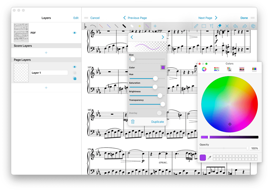
forScore takes full advantage of new system features and components in iOS and iPadOS 14 like Color Pickers which provide a beautiful, consistent experience across all apps and reduce the amount of work we have to do to maintain our own version.
We’ve also adopted Apple’s new photo picker for an improved experience when adding one or more images to Scan or when creating your own stamps. Dashboard now uses sidebar navigation instead of a tab bar whenever space allows, and pull-down menus make several quick interactions even easier.
Along with Scribble, these enhancements add up to a better experience that ensures you can take full advantage of Apple’s latest updates right from day one.
Actions
Throughout the app, swipe actions now use iconography and color-coding to provide more consistent visual cues that help you pick the right one more quickly.
New swipe actions and contextual options in many of forScore’s menus make it easier to add a score or bookmark to a setlist, with the most recently-viewed setlist right at the top for easy access.
You can even swipe or use contextual menus to share an entire category—or everything in the current library if you choose “All Scores”—to send those items in a variety of formats or to share them as a text list.
Setlists
Streamlining your workflow is even easier with our new open setlist format that lets you create setlists from files already in your library.
These setlist representations use the same 4SS file extension that forScore uses internally, but they contain a very simple and easy to understand XML-based description of their contents.
Include scores, bookmarks, and even placeholders. Automate the creation of weekly setlists. Build functionality into your own product, service, or organization’s administrative tools.
Visit our developer page to learn more about our new open setlist file format.
One more thing…
A whole new platform.
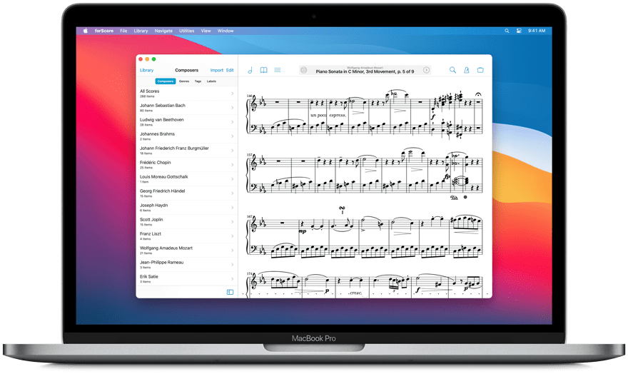
forScore comes to the Mac in a big way with a brand new, fully native experience built for some of the most advanced and powerful devices out there. forScore runs on macOS Big Sur, both on Intel and Apple Silicon-powered Macs, and it’s included with forScore for iOS and iPadOS as a universal purchase.
That’s right—it’s absolutely free for everyone who has ever bought forScore.
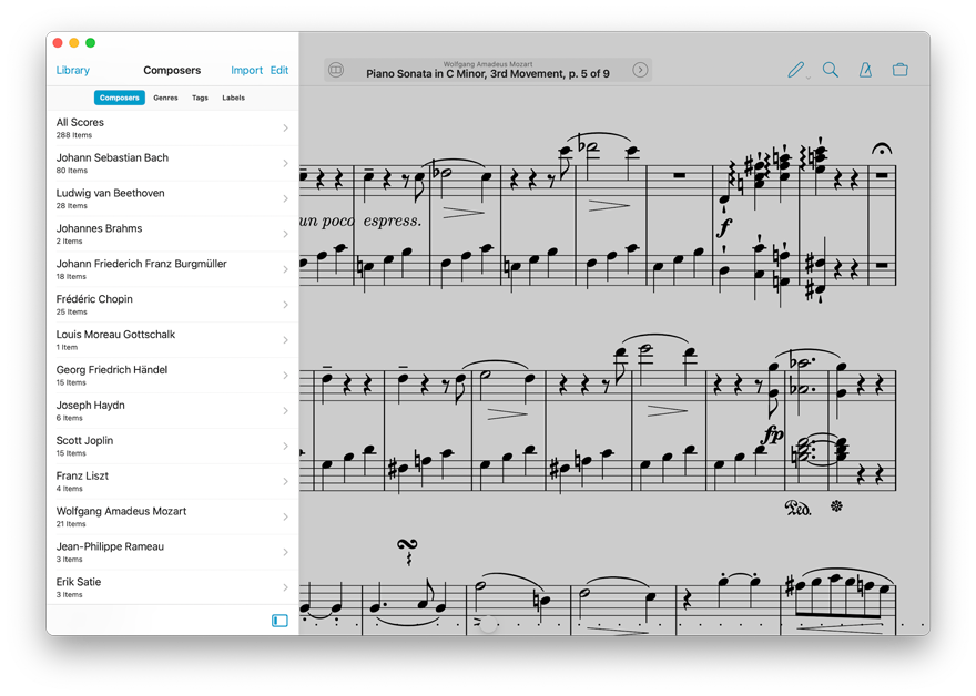
Tailored for Mac
From the menu bar to the touch bar, forScore is incredible on the Mac. It adapts to any size with a powerful new split view layout that lets you work like never before. It’s blazingly fast, easy to use, and feels right at home on Apple’s latest OS.
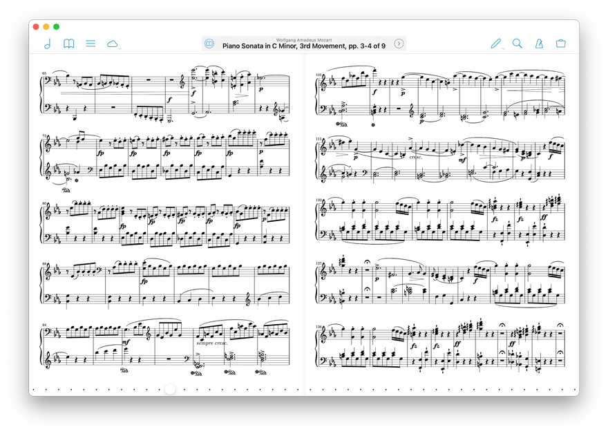
Extended & Enhanced
Use drag and drop to import files. Connect to nearby devices and use Cue to synchronize page turns. In annotation mode, use the sidebar to easily access layers, stamps, or shapes at any time. It’s everything you know and love about forScore, bigger and better than ever.
A New Chapter
Bringing forScore to the Mac is just the beginning—a whole new platform means a whole new set of opportunities. From subtle refinements to major new features already in development like iCloud Syncing, we’re building the future one step at a time.
We’re just getting started. Again.
Available Now.
forScore 12 and all of these amazing upgrades are available now for iOS, iPadOS, and macOS. forScore 12 is a free update for all existing users, available across all supported platforms at no additional charge. Get it today on the App Store, and be sure to check out our news page or use our RSS feed to follow our latest news and announcements.

