iOS 9 App Design
The first iPhone apps were wonderfully simple from a design standpoint. Developers could create one, perhaps two (if they supported landscape orientation) pixel-perfect layouts and know that their interface would always look exactly the same. Unlike PCs with windowed software that’s almost infinitely resizable, mobile software on the iPhone began with a single screen size: 320 pixels wide, 480 pixels tall, with a 20 pixel high status bar along the top.
Later, the iPhone 5 ushered in Apple’s first mobile screen size change and the iPhone 6 and 6 plus pushed those limits even further. Meanwhile, iOS 7 blurred the lines between the status bar and an app’s interface canvas. For the most part, however these shifts were subtle. An app designed for an iPhone 4 can usually scale up to the iPhone 6 plus by simply displaying more content or by adding space between sets of controls. In fact, much of this happens automatically.
With iOS 9, however, things are shifting more dramatically. Apple’s new multitasking modes for iPad can contort apps into some very unique shapes. The wildest example, perhaps, is the 320 pixel wide but 1024 pixel tall column that apps can be put into when used in Slide Over or as a secondary app with Split Screen. Some interface elements like long scrolling table views, for instance, can handle this shape just fine. Other specialty panels have a harder time.
The best example of this is forScore’s Stamp creator/editor. It allows users to draw their own stamps onto a square canvas, so everything has to be designed around that. That leaves varying amounts of space either on the bottom or the right of the canvas, depending on the situation. Combine two possible interface orientations with five screen sizes and add four additional app window sizes for the new iPad multitasking modes and you come up with over a dozen different possible layouts. Adding more space just doesn’t cut it here.
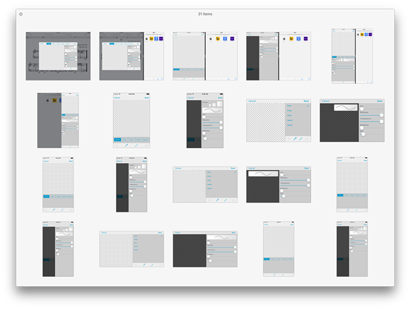
So we had to take a different approach. The panel’s major collections of interface elements (the canvas, the tool picker, the drawing style sliders, and the stamp previews) all had to be isolated and presented with a hierarchy of importance. Some things move around as needed, others collapse into hidden areas, and still others disappear entirely if there’s just no room for them. It’s a far cry from simply designing one, two, or three different layouts for different screen sizes.
Another example is the metadata panel. On an iPad, when using most of the new split-screen modes, the menus are presented full-screen instead of within popovers. Unlike an iPhone, however, the iPad layouts are much taller and leave a bunch of empty space at the bottom. So now, if you’re using one of these modes, you’ll see additional statistics from forScore 9’s new Dashboard feature. It’s helpful, but not essential, so it can appear when practical and disappear otherwise.
Like many of Apple’s biggest paradigm shifts, there isn’t a single point at which every developer switches from one approach to the next. The tools and technologies are usually optional, and some of them never end up making sense for a particular app. At some point, though, one more change can be enough of a push. For us, now, this is the pivot point. No longer can we design around devices, we must consider how we use space—any amount of space—even on devices that haven’t been released yet. It’s a big challenge, and one we won’t get right every time, but it’s exciting and we can’t wait to show you what we’ve done when iOS 9 is released later this year.