Last week we began our discussion of forScore’s media playback features with a look at associating scores in your library with audio tracks in the iPad’s shared system library. That’s just one source of music, but there’s another: today we’ll be discussing how to do something similar with audio files that copied to forScore’s Documents directory rather than having been purchased through the iTunes store or synced from your computer’s iTunes library.
As a quick recap, associating a score with an audio track is done through the metadata panel. Select the “audio” tab in the lower section of this panel and tap the circled notes icon to choose an item from the system’s music library. Next to that button, though, there’s a similar icon with a document or page shape. That button allows you to choose an audio track that’s stored in forScore’s Documents directory, and virtually everything else about it is the same.
So how do you get audio tracks into the Documents directory? The same way you add PDFs to forScore: copied from your computer using iTunes’ file sharing panel, by using forScore’s services panel to download them from a cloud service like Dropbox, or by importing files from other apps that support the “open in…” function. Once you’ve linked up an audio file, you can control playback just like you would have in last week’s example.
Whether you use the iPad’s shared music library or you copy files over manually really depends on where your music is. If you already bought a track through iTunes, or if you’re using Apple Music to stream songs from the cloud, using the system library is the easiest (and sometimes only) way to access that track. If you’ve already got an MP3 file on your computer or you’re looking for a public domain recording you can download and reference in a hurry, using an audio file is likely going to be an easier method. It’s all up to you, so just pick what makes the most sense in each case and mix and match sources as much as you like.
Sometimes it helps to be able to play music while using forScore, and not just have music playing, but also to be able to make it easier to control playback and get the right song ready at the right time. Whether you need some accompaniment while you practice, a backing track on stage, or just need to hear something to help you learn it, audio tracks are the answer.
With forScore, you can do all of these things: associate each score or bookmark in your library with one or more audio tracks so you don’t have to find them every time, and control playback, loop a specific section, change the speed and pitch of the track, and even record yourself and play it back later—all without leaving the app. There’s a lot you can do, so over the next few weeks we’ll be taking a look at different parts of forScore’s media system, starting with the different sources of music you can access.
The first and most common source of music is the iPad’s shared system library, or the Music library (with a capital “M” because it’s the same library you access through the Music app). When you sync music to your iPad through iTunes, or buy a track through the iTunes store on your device, this is where those tracks end up. Developers like us can request read-only access to this information in order to provide additional features. In the lower section of the metadata panel, select the “audio” tab and press the circled note icon (it looks like the iTunes icon). Browse by artist, album, genre, composer, playlist, or view all songs. When you find the track you’d like to use, just tap it. Keep browsing to add other tracks, then tap “Done” to close the media picker.
Once you’ve done that, you’ll see the media box along the bottom of the screen—it appears and disappears along with the navigation bar when you tap the center of the screen. Press play to start your song, drag the seek bar back and forth to go to a specific point in the song, and use the pause and back buttons as needed to control playback. If you have more than one track set up, swipe left or right over the album artwork to change the current song.
Those are the basics, but we’ll be back next week and beyond with much more!
Job number one for any sheet music reader is making sure basic navigation is as straightforward as possible while offering enough flexibility to work for the wide range of musicians and instruments out there. The fundamentals of page turning in forScore haven’t changed much since its introduction over seven years ago, but we’ve added a lot since then. The best example of this is the Page Turners & Shortcuts section of forScore’s settings panel.
Not long after the iPad’s (and forScore’s) introduction, we started hearing from companies that were looking to create physical devices that could help musicians turn pages without reaching up to touch the screen. In many cases, this took the form of wireless, Bluetooth foot pedals that mimicked keyboards to pair and communicate with the iPad. App developers weren’t able to directly monitor these keyboard inputs, however, so we had to get creative to adequately respond to those incoming signals.
Fortunately, Apple greatly improved the situation in 2013 with the release of iOS 7, allowing apps to respond directly to keyboard shortcuts. We used these new functions to add the “Page Turners & Shortcuts” section to forScore’s settings panel. It allowed users to tap a command, then press a key on their device, remapping that keystroke to the corresponding function whenever they used the device with forScore. We didn’t just use it for page turns, however—we added support for dozens of features like controlling audio playback, activating links and buttons, starting and stopping the metronome, and much, much more.
After the introduction of Apple’s Smart Keyboard cover, we made working with a standard keyboard more powerful by adding default shortcuts for many of forScore’s most popular features (any of which can be remapped to different keystrokes or pedal presses). With a traditional keyboard connected to your iPad, press and hold the command key to see all of the options available to you on the current screen.
This panel isn’t just limited to keyboard-based devices, it also works with MIDI devices: tap a function, use your MIDI device to send a command, and from then on you’ll be able to trigger that function at any time by sending that same signal. It also works with select Bluetooth Smart devices such as the iRig BlueBoard and FiftyThree Pencil. These devices can even send two types of signals: one for a standard button press, and another for a longer press and hold.
If you use forScore with a page turner, smart stylus, or keyboard, be sure to take a peek at this powerful panel if you haven’t already. You might just find a better way to work.
One of forScore’s most popular features is Rearrange, a tool that allows you to duplicate, reorder, rotate, or delete pages of a PDF in your library. In previous versions of forScore, Rearrange began by generating thumbnail images of each page to give you a good overview of your document. Depending on the length and size of your PDF file, this process could range from virtually instantaneous to painfully slow, and could even cause a crash if the iPad ran out of memory before finishing the process.
In forScore 10.2 we revisited this weakness and came up with a much better solution (even after seven years, there’s still room for improvement!). Now, instead of loading up all of those thumbnails at once, we only generate the images you’ll see on screen. As you scroll, forScore generates new images in the background and updates them as soon as possible, keeping scrolling as smooth and responsive as ever. We also use system-level caching to preserve off-screen images as long as possible while letting iOS decide when it needs to free up memory.
The advantages are easy to see: faster load times, fewer crashes, and all of the same features as before. Save the results as a new PDF file, or overwrite the original, and you’re done—all without the round trip to your computer.
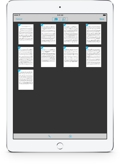 With forScore 10 we added a lot of functionality to Darkroom, our utility that lets you snap photos with your camera or import images from the Photos app to create a new PDF in your music library. We added the ability to automatically enhance your images, adjust their brightness, saturation, and hue, and we included the ability to crop your images—even accounting for distorted perspective when needed.
All of these new tools opened the door to some really powerful editing, but with the expanded functionality came some tougher requirements. Users who had never had any issues before started experiencing low memory crashes when working with an average number of images, so we knew we had to find a solution.
In forScore 10.2, we created an advanced caching system that keeps what it needs in memory to ensure that you can work quickly, but intelligently and transparently offloads the rest to disk so you can add far more pages to your file without worrying about losing your work. And, if something does go wrong, your session isn’t lost forever: reopen Darkroom and you’ll be asked if you’d like to continue where you left off, or if you prefer to start over from scratch.
The iPad is an incredible machine with some tight technological constraints. We can never prevent all crashes, but with forScore 10.2 your work is given the highest priority—we significantly reduced the likelihood of a crash while simultaneously minimizing the consequences of one.