December 9, 2016
| Feature of the Week
Last week we took a look at forScore’s Stamps tool, part of the annotation system that allows you to place detailed, reusable symbols on the page. We briefly explored the Stamps palette, which you can see by tapping once to select the Stamps tool (if not already selected), and then tapping again.
One part of this panel that we didn’t discuss is the “Tint” button in the top right-hand corner. This button lets you change the color of your stamps quickly and easily: tap on it to pick your color, and use the switch at the top to enable or disable tinting. Although all of the default stamps are black, stamps can be any color or even multiple colors (check back next week for more on that). When tinting is disabled, your stamps are drawn in their original form. When tinting is enabled, however, forScore uses your stamp’s shape and opacity but replaces all colors with your selected tint color, much like a rubber stamp and an ink pad.
This feature makes it easy to use just one stamp for multiple purposes, color-coded to whatever system you use to remember important details. It also helps stamps stand out from the page a little more, so they don’t just blend in with the original sheet music.
Things get even more interesting when you create your own stamps, as you’ll see next week, so be sure to check back then as we conclude our series on forScore’s indispensable Stamps tool.
December 2, 2016
| Feature of the Week
We’ve discussed forScore’s annotation features a lot, but one feature that’s been part of the app since almost the very beginning is the Stamps tool. It allows you to place commonly-used symbols right onto the page without needing to draw them manually. It works great for small, detailed markings like numbers, sharps, flats, and other notation symbols.
To use the Stamps tool, activate annotation mode by selecting it from the tools menu or pressing and holding your finger on the page for a moment. On the left-hand edge of the annotation toolbar you’ll find the Stamps tool, a flat symbol by default. Tap once to select it, then tap again to see the Stamps palette. This panel allows you to choose from a wide range of symbols (scroll up and down to see all 80 of the stamps we include by default). Tapping on any of these symbols changes the active stamp in the toolbar, and using the slider at the bottom of the Stamps palette lets you control the size of your stamp.
With your stamp selected and resized to fit your music, touch and hold your finger on the page and drag it around to see a preview loupe. When you’ve got the perfect spot, just let go and the stamp will be drawn onto the page. You can do this even when the Stamps palette is showing—it’ll disappear when you touch the page so you can see what you’re doing, and then reappear when you’re done (great for adding several different stamps in quick succession).
If you find yourself using some stamps more often, you can rearrange them to better suit your needs. Just tap and hold on any stamp for a moment, then drag it to a more appropriate spot. Putting your favorites right up at the top for easy access can really speed up your workflow.
There’s much more to this feature, though, so be sure to check back over the next few weeks as we dive a little further into this tremendously useful tool.
November 25, 2016
| Feature of the Week
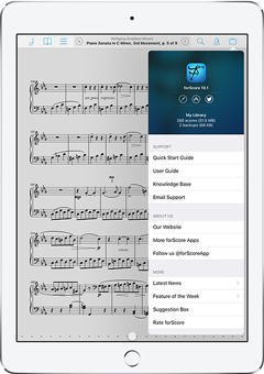 After last week’s monolithic feature on forScore and Apple Pencil, today we’re taking a breather with a quick look at the Support section of forScore’s tools menu. We redesigned it with forScore 10.1, and it includes a few new things of note.
The top section doesn’t just look different, it includes quick links to our website, to all of our apps on the app store, and to our Twitter account. Each of these is also featured in the list below, which has been reorganized and expanded to better address our users’ most common needs.
You can get help by checking out the quick start guide, user guide, our knowledge base, or by emailing us directly. You can also use the links we just discussed to learn more about forScore at our website, see our other apps, or follow us on Twitter. Finally, you can stay up to date with inline versions of our news and feature of the week sections (hey, that’s us!), send us your suggestions, or rate us on the App Store (it really helps).
Now that this panel includes more news and general information, it’s really more than just a “support” section, so we added an “About forScore” entry to the bottom of the settings panel that also opens it. For anyone needing to know which version they’ve got, this is a pretty logical place for them to look. We still want to make sure that these important resources are readily available to anyone who needs help, though, so we’ve kept the “Support” item in the tools menu as well. Both options get you to the same place, so it doesn’t matter which one you pick.
If you’re looking into buying a page turner for yourself or as a gift this holiday season, AirTurn’s annual Thanksgiving sale is a great time to act. From now until Monday, November 28th, get 20% off storewide by using coupon code AIRTURKEY.
November 18, 2016
| Feature of the Week
We’ve taken a look at some of the improvements made to annotation in forScore 10.1 over the past few weeks, and today we’re closing out that series with a look at the biggest piece of the puzzle—Apple Pencil. It’s been just over a year now since Apple introduced this slick stylus and we’ve worked very hard since then to provide an annotation experience that takes full advantage of its unique capabilities without disrupting anyone’s existing annotation workflow (especially important for users without an iPad Pro or Apple Pencil).

The first thing we had to do was turbo-charge our annotation engine. We’d already spent 5+ years optimizing it for exceptional performance on a wide range of devices, so adapting to accommodate the latest hardware’s ability to provide four times as much data was no small feat. With forScore 9.3, we did just that. We also added support for Pencil’s pressure sensitivity, but that was just the start.
The biggest change in forScore 9.3 was the ability to automatically activate annotation mode by simply drawing on the screen with Apple Pencil. It was a game changer for the annotation experience, and provided a huge upgrade for Pencil users while remaining completely transparent for everyone else.
This was a big step forward, but it certainly wasn’t the end of it. Since forScore saves the last drawing preset or annotation tool you were using and keeps it active the next time you start annotating, and since the annotation toolbar isn’t visible until you activate annotation mode, the experience became less predictable (especially after switching back and forth between drawing and erasing). So in forScore 9.4, we added settings to let you control how annotation tools are saved between sessions.
Although iOS includes palm rejection to block unintentional touches (such as resting your hand on the screen while you write with Apple Pencil), some users found that they were occasionally ending up with stray marks on their sheet music. To address this, we added a new setting in forScore 10.0 to disable finger drawing if you’ve activated annotation mode with Apple Pencil. If you enter annotation mode manually, finger input still works normally—we do this in case you need to annotate and your Pencil is out of reach or out of power.
Each of these changes pushed the annotation experience forward, offering fine-grained control to the users who need it while remaining natural to newcomers and unobtrusive to the majority of our users who don’t have an iPad Pro or Apple Pencil. They were tough to hone in on and even tougher to implement, but in the end we created a system that we were very proud of. Except for one thing: persistent feedback from users that the experience still felt incomplete. They loved that they could annotate by simply drawing, but disliked that they still had to tap the “Done” button to save their changes when they were finished.
Which, finally, brings us to forScore 10.1. With this most recent update, we added a setting that allows forScore to automatically save your changes and exit annotation mode after a period of inactivity. We considered this idea for a long while and consistently came away with two major sticking points: that activating annotation mode and saving changes over and over again is resource intensive, and that any unintentional collision with your Pencil could result in permanent changes to your annotations.
To solve the first problem, we went back to our annotation engine once again to squeeze even more performance out of it. We aimed high, rolled up our sleeves, and ended up with a remarkably novel yet reliable way of improving efficiency and fine-tuned drawing to an unprecedented degree. This is hard to overstate: we moved metaphorical mountains.
That left the possibility of unintentional markings. To solve this problem, we expanded our undo/redo system to work between annotation sessions as long as you stay on the same page. We discussed this change last week, so be sure to check that out if you haven’t already.
Now that this is the lengthiest feature of the week yet, it should be clear that annotation is incredibly important to us. We continue to push so hard because we know that it’s the make-or-break feature for many musicians out there. We want forScore to be the best app it can be, and for so many of our customers that means annotation has to be simply best in class.