forScore 13Available Now

Back to play.
We can’t replace the time we’ve lost, but we’re all ready for a comeback tour. With forScore 13, we’re picking up the pieces and taking what’s most important—what works best—and transforming it into something completely new. We’re evolving, refining, and reinventing forScore so we can all put our best foot forward as we head towards new opportunities and rediscover the simple things we’ve missed.
Windows
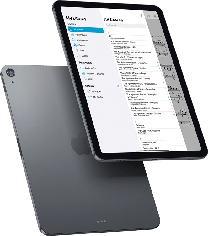
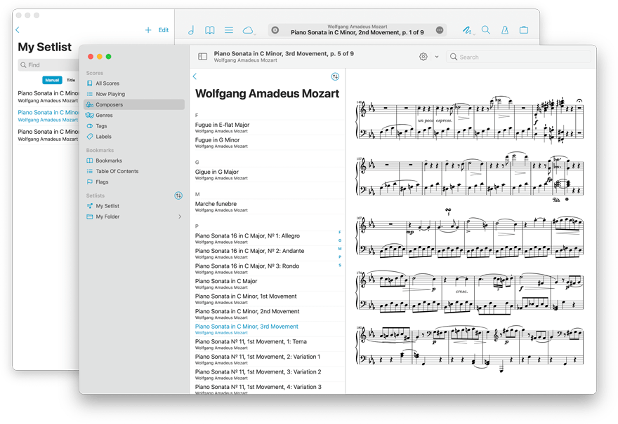
This year we didn’t just add support for multiple windows, we created an entirely new experience from scratch that’s built using the latest technologies, interface elements, and design cues. It’s like forScore 2.0 all over again, and this is just the start.
Secondary windows provide a modern, read-only browsing experience that combines many of forScore’s menus into a single unified hierarchy. They also include key features like annotation, display modes, two-up mode, half-page turns, Face Gestures, Reflow, support for page turners, and they give you access to editing tools like Links, Buttons, Rearrange, and Crop.
Over time, we’ll be bringing over even more of forScore’s best tools and features, updating them or entirely reimagining them when appropriate, in order to define a whole new experience that’s infused with everything we’ve learned since we began over a decade ago.
Flags
When you’re working quickly, Flags let you mark a page so you can remember to come back to it later. Like dog-earing a piece of paper, it’s a quick and easy alternative to entering annotation mode and writing a note to yourself.
Flags can be found in the Bookmarks menu, where you can tap the flag icon to toggle the current page’s state. Or, if you’re using two-up mode, easily flag or unflag the left or right page with just a few taps. View all flags for the current file, or see a list of flags from all of the scores in your library.
For even quicker access, flagging is available right from the title bar’s contextual menu and can also be configured for use with gestures, page turners, and keyboard shortcuts.
Design
The building blocks of iOS and iPadOS apps have changed dramatically over the last few years. From contextual menus and pop-up buttons to SF Symbols (Apple’s library of system-provided icons), the time was right for a big refresh of some of forScore’s most important elements.
Most of forScore’s images have been replaced with system icons, making the app smaller and giving us a much more descriptive and flexible way to precisely identify hundreds of unique features and functions in any context without bloating our app or maintaining different sets of icons for every major OS redesign.
Finally, in response to design feedback from Apple, we’ve streamlined, simplified, and combined a number of older interface elements to create a more natural and intuitive experience for all of our users. We refocused the title bar’s center display on the essentials, simplified gestures, and made dozens of other subtle improvements.
Annotation
Stamps can now be individually resized and tinted so you don’t have to adjust your settings each time, and you can easily duplicate stamps so you can modify them or set a unique tint color for each one.
The Stamps and Shapes panels are now free-floating and can be resized and moved anywhere on screen so they’re always available without getting in the way. It’s the kind of thing we’ve been waiting for Apple to provide for years now, so we finally decided to just create our own and we couldn’t be happier with the end result.
Adjusting the size of stamps, shapes, and drawing presets is even easier with a new resizing component that combines the original slider with a new percentage button that can be used to see and precisely set their size.
Display Options
forScore 12 introduced a powerful new page rendering and layout system that allows us to do a lot of things we never could have before, like provide display options that give you the best possible view of your music. These display modes work great when using portrait orientation or two-up mode, but until now they had no effect when viewing a single page in landscape orientation.
With forScore 13, you can choose between the original scrolling behavior or Best Fit mode which fits the height of the page to the height of the screen so you can see the whole page at once.
The Display Options interface is now exclusively where you’ll find performance mode and Reflow, along with Face Gestures and AirPods Pro gestures (since all of these can now be enabled per-window). Just double tap the center of the page to access this overlay, or tap the gear icon in the redesigned title bar.
Theme
For years, forScore has offered the ability to customize its tint color and when Dark Mode came along we automatically adapted these colors to look great in all cases. Now, if you prefer, you can choose two distinct colors for light mode and dark mode and even pick from eight presets inspired by Apple’s latest line of colorful iMacs. We think more and more people will want to customize their forScore experience, so we’re moving these options out of the Accessibility settings.
Thanks to our wide adoption of highly configurable system-provided icons, we’re also excited to be able to provide a new accessibility setting that uses a bolder style for these symbols in most places throughout the app, improving visibility while looking better than ever.
iCloud Sync
This spring we provided iCloud Syncing to forScore Pro subscribers as an early access feature. Now that we’ve fine-tuned things a bit, we’re ready to bring it to everyone.
Syncing was a huge undertaking and took a lot of work to get right. There were policy concerns (what Apple will allow through App Review), legal and privacy concerns, as well as just all of the nuts and bolts of ensuring that changes are coordinated properly and efficiently. It was a long wait, and we sincerely appreciate your patience.
iCloud Sync is totally automatic and efficient, ensuring your edits are reflected across all of your devices. It uses the same storage quota as everything else on your Apple devices, so upgrading to more when needed is easy and handled exclusively by Apple.
Shortcuts
This year Shortcuts comes to the Mac, so we thought it was the perfect time to add advanced automation functions to forScore—and boy, did we.
Thirty operations allow you to do things like import, export, add, remove, find, move, and rename scores, bookmarks, setlists, placeholders, and setlist folders. It’s a lot of functionality that we think will really open up the possibilities for power users to manage and edit their music libraries.
Chain these actions together using the Shortcuts app to automate your most common tasks, then add them to your home screen to access them at any time.
The whole point. And click.
Last year forScore came to the Mac, and we focused hard on providing a stable, consistent experience that’s only different when it’s better. This year we’re continuing that mission by adding new settings and changing default behaviors to make the Mac experience feel even more natural.
Unlike on touch devices, where screen size is more often a limiting factor, forScore on the Mac no longer automatically hides the navigation bar. Depending on your display options and window size, showing the navigation bar now shrinks the page to fit the available space rather than moving downward below the bottom edge of the window. This prevents unnecessary scrolling and ensures you can see the whole page at all times.
Along with all of the other improvements coming in forScore, including syncing and a brand new secondary window built from the ground up with cross-platform compatibility in mind, forScore is the best way to view and manage your sheet music on your Mac.

Available Now.
forScore 13 and all of these amazing upgrades are available now for iOS, iPadOS, and macOS. forScore 13 is a free update for all existing users, available across all supported platforms at no additional charge. Get it today on the App Store, and be sure to check out our news page or use our RSS feed to follow our latest news and announcements.

