August 13, 2015
| In Depth, News
The first iPhone apps were wonderfully simple from a design standpoint. Developers could create one, perhaps two (if they supported landscape orientation) pixel-perfect layouts and know that their interface would always look exactly the same. Unlike PCs with windowed software that’s almost infinitely resizable, mobile software on the iPhone began with a single screen size: 320 pixels wide, 480 pixels tall, with a 20 pixel high status bar along the top.
Later, the iPhone 5 ushered in Apple’s first mobile screen size change and the iPhone 6 and 6 plus pushed those limits even further. Meanwhile, iOS 7 blurred the lines between the status bar and an app’s interface canvas. For the most part, however these shifts were subtle. An app designed for an iPhone 4 can usually scale up to the iPhone 6 plus by simply displaying more content or by adding space between sets of controls. In fact, much of this happens automatically.
With iOS 9, however, things are shifting more dramatically. Apple’s new multitasking modes for iPad can contort apps into some very unique shapes. The wildest example, perhaps, is the 320 pixel wide but 1024 pixel tall column that apps can be put into when used in Slide Over or as a secondary app with Split Screen. Some interface elements like long scrolling table views, for instance, can handle this shape just fine. Other specialty panels have a harder time.
The best example of this is forScore’s Stamp creator/editor. It allows users to draw their own stamps onto a square canvas, so everything has to be designed around that. That leaves varying amounts of space either on the bottom or the right of the canvas, depending on the situation. Combine two possible interface orientations with five screen sizes and add four additional app window sizes for the new iPad multitasking modes and you come up with over a dozen different possible layouts. Adding more space just doesn’t cut it here.
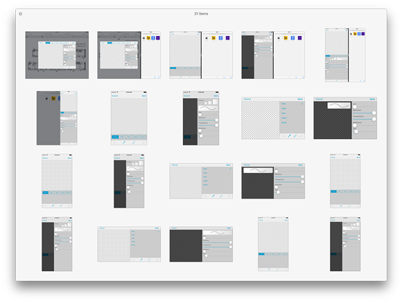
So we had to take a different approach. The panel’s major collections of interface elements (the canvas, the tool picker, the drawing style sliders, and the stamp previews) all had to be isolated and presented with a hierarchy of importance. Some things move around as needed, others collapse into hidden areas, and still others disappear entirely if there’s just no room for them. It’s a far cry from simply designing one, two, or three different layouts for different screen sizes.
Another example is the metadata panel. On an iPad, when using most of the new split-screen modes, the menus are presented full-screen instead of within popovers. Unlike an iPhone, however, the iPad layouts are much taller and leave a bunch of empty space at the bottom. So now, if you’re using one of these modes, you’ll see additional statistics from forScore 9’s new Dashboard feature. It’s helpful, but not essential, so it can appear when practical and disappear otherwise.
Like many of Apple’s biggest paradigm shifts, there isn’t a single point at which every developer switches from one approach to the next. The tools and technologies are usually optional, and some of them never end up making sense for a particular app. At some point, though, one more change can be enough of a push. For us, now, this is the pivot point. No longer can we design around devices, we must consider how we use space—any amount of space—even on devices that haven’t been released yet. It’s a big challenge, and one we won’t get right every time, but it’s exciting and we can’t wait to show you what we’ve done when iOS 9 is released later this year.
June 19, 2015
| In Depth, News
There has been a common notion in the media for the past year or so that the iPad just isn’t doing very well. If you look at Apple’s quarterly earnings reports and iPad sales, it’s obvious: people are buying less of them than they once did. That’s a hard fact, but it shouldn’t be sensationalized as the premature death of the post-PC era—especially just as things are really starting to heat up.
Long upgrade cycles, the introduction of the iPhone 6 and 6 plus, and a resurgence in PC sales after a long period of processor stagnation have all played their part in slowing the iPad down. But arguably the biggest problem with the iPad today is that every major exclusive software innovation it features was introduced way back in 2010. Every iOS update since then has made the iPad more like the iPhone, and it’s a tough sell when almost everything that makes iOS on the iPad unique is five years old. Fortunately that’s about to change in a big way.
This year’s WWDC, Apple’s annual developer conference, just wrapped up last week. Apple unveiled iOS 9 and, although it’s lighter on big features than previous releases, a lot of the new stuff seems to be focused squarely—if not exclusively—on the iPad. New trackpad-like features don’t appear to be iPad specific, but Apple clearly had bigger screens in mind when designing them. The headlining features, though, are all iPad-specific: picture-in-picture, slide over, and split screen multitasking. In fact, that last one is exclusive not just to the iPad, but to the newest iPad Air 2.
Last year’s introduction of the iPad Air 2 should have been a bigger deal. With an incredibly powerful 3-core CPU, 2GB of RAM, and touch ID, it was even thinner and lighter than the previous year’s model. Yet it ended up being little more than a footnote in the media. After all, what good was all that power without some new software features to help users take advantage of it? Developers soon discovered that some of the changes made in iOS 8 seemed to indicate that a split screen mode was in the works, but that it simply wasn’t ready for prime time. This year it is.
Just as long as there have been rumors of a split-screen mode for the iPad, there have also been rumors of a larger iPad, generally dubbed the ‘iPad Pro.’ Of course, there’s no reason to believe that just because one of these rumors panned out, the other will as well. We’ve been working hard to get ready for iOS 9’s release this fall and although the beta is not stable enough for everyday use, the Split Screen and Slide Over features make a lot of sense on the existing iPads that support it. That could be the end of it, but where there’s smoke, there’s fire.
Many people seem to immediately dismiss the idea of a larger iPad because it doesn’t make sense for them, but the whole reason product lines exist is to satisfy the needs of unique groups within the larger market. The iPod Classic could never have suited the needs of everyone who bought an iPod mini, nano, or shuffle, and the iPad isn’t perfect for a lot of people. Which people? Yes, you already know where this is going: musicians. Many forScore customers want a device with a bigger screen, and although it has seemed like the rumor that would never come true, the pieces all seem to be falling into place. We won’t know for sure until this fall, but iOS 9 seems like a big part of this puzzle and we can’t wait to see what comes next.
April 1, 2015
| In Depth, News
Five years ago this month we released forScore 1.0, and with a hundred updates since then it’s easy to forget where it all started. That’s why we’ve put together a special retrospective to celebrate our journey so far and to look back at those incremental changes as part of a larger story. Whether you’ve been a loyal forScore user from the start or you just recently discovered it, you’ll be surprised to see how much things have changed.
We say it often, but it’s always true: we couldn’t do it without you. The support and feedback of our customers has always been our greatest asset, and we can’t thank you enough. Here’s to five years so far, and to the next five!
November 11, 2014
| In Depth
The iPad was designed for fingertips, plain and simple, but that hasn’t stopped countless companies from creating input devices of all shapes and sizes. Over time, they’ve gotten bigger and smaller, smarter and simpler, and this summer we sat down to see if we could take advantage of some of them to improve forScore’s annotation experience with version 8.0.
Of course, the majority of these products work right out of the box. They’re basically capacitive sponges on sticks, and that’s that. To really make a meaningful impact, though, they also need to communicate with the iPad to offer additional features like palm rejection, and the best way to do that is with Bluetooth Smart (aka Bluetooth LE, Bluetooth 4.0). That narrowed things down for us, and we identified three companies that offered something we thought could help our users: Adonit, FiftyThree, and Ten One Design. (more…)
November 3, 2014
| In Depth, News
In the summer of 2012, over two years ago now, forScore 4 had just hit the App Store and we were beginning to transition forScore over to Core Data. iOS 6 had just been announced, and Apple Maps was gearing up to make waves that still haven’t completely settled down. Since then, we’ve released forScore 5, 6, 7, and now 8, but that’s only half of the story.
This is the story of forScore mini: how we created it, why, and how it reflects the shifts in Apple’s strategy and its priorities. (more…)