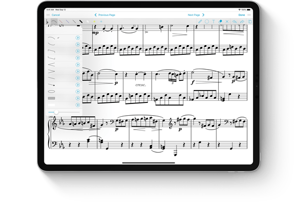

Today we’re thrilled to announce the immediate release of our latest major update to forScore, version 10.5. It’s a big update in more ways than one: we’ve optimized forScore for the latest iPad Pros with ultra slim bezels, Face ID, and no home button. The expansive screens on these new devices are incredible and we know the forScore experience will grow right along with it.
That’s just the tip of the iceberg, though, because forScore 10.5 also supports the new Apple Pencil and its double tap gesture. While annotating, use this gesture to switch between the current tool and the eraser, between the current and last used tool, or to show the current tool’s detail view. When you’re done annotating, assign the gesture to one of forScore’s other functions or tools for instant access from anywhere.
Whether you’re upgrading to a new iPad on day one or not, there’s a lot more for everyone in this update. New shapes and shape settings, a streamlined “prevent finger drawing” option, the ability to move multiple pages at once in the Rearrange panel, filter improvements, and the ability to recover recently deleted scores and setlists make this the most incredible version of forScore yet. Learn more about all of these changes and more here.
And, just as always, it’s completely free for all existing users. Check out forScore 10.5 and forScore mini 3.5 today on the App Store, and thanks once more to all of our amazing beta testers who helped us get this release ready for prime time.
Available now for iPad
Available now for iPhone and iPod Touch
Earlier this year we introduced 4SB Archives which let you export all of your scores, bookmarks, setlists, annotations, settings, and more as a single file that can be copied to a computer or uploaded to your preferred cloud service. Since archives duplicate all of your files they’re much larger than 4SB Backups. If your device is running low on storage space you may not always be able to create them, and that’s where our newest app comes in.
We’re very excited to introduce forScore Backup Utility, a free app for macOS 10.13 or later that lets you archive your forScore library directly to a Mac using your device’s USB cable. Since forScore securely transfers your information one chunk at a time, the complete archive is never actually stored on your device. If you need to restore from a backup, the process works similarly but in reverse. It works with forScore 10.5 or later and forScore mini 3.5 or later, both available now.
It’s fast, easy to use, and completely free. You can learn more about it here, and if you missed it be sure to check out everything else that’s new in today’s forScore updates.
Available now for macOS 10.13 or later
We’ve written over 180 Feature of the Week articles since we started this series all the way back in April 2015! That’s a lot of typing, so it’s time for us to take a quick break as we work towards releasing our next major update—and while we await Apple’s upcoming big event (announced earlier today and scheduled for October 30th). We’ll be back then with plenty to discuss, so stay tuned and feel free to peruse the archives for any features you may have missed.
When Apple unveiled iOS 11 and its new Drag and Drop system, we were incredibly energized and embraced it as fully as we could. We thought (and continue to think) that these gestures help make common tasks far easier, quicker, and more natural.
For some, though, Drag and Drop can get in the way. Users with mobility issues and others who simply find the gestures to be uncomfortable may prefer to disable them entirely. While iOS offers no help in this regard, our latest updates include a new accessibility setting that prevents forScore from offering drag targets in most views. You can still drop things like PDF files into forScore to import them, but other interactions will be more like they were in iOS 10 and earlier.
The most notable of these interactions is setlist reordering: with Drag and Drop disabled, tapping the “Edit” button in many list views shows the reorder controls on the right-hand side of each item (the three horizontal lines). Drag these up or down to reposition an item, no need to tap and hold.
One other big change caused by the introduction of Drag and Drop pertains to Quick Peek, the ability to preview items in many of forScore’s menus before you select them. With Drag and Drop enabled you’ll need to tap and hold with two fingers to see the preview; with it disabled you only need to use one finger. (Swiping from left to right over the item still shows the “Peek” option which is unaffected by this accessibility setting.)
We think Drag and Drop is amazing and helps a lot of people, and we also know it’s not for everyone. It’s surprising that Apple hasn’t included a system-wide option to disable them, but until they do we think this will really help.
When using forScore’s Rearrange tool, you can insert additional pages by selecting an existing item in your library or by choosing a template and specifying how many pages you need. It’s a great way to merge PDFs when you need fine-grained control over where each page ends up.
With our latest forScore updates we added the ability to use iOS 11’s Drag and Drop gestures to insert pages from any PDF file, even if it hasn’t already been imported into your library. To use this feature, drag a PDF file from another app—like the Files app—and drop it into the Rearrange panel. Once you do, the file’s pages are added to your workspace and you can duplicate, arrange, or delete them as needed. When you’re done, save your results and you’ll have just what you need and no extra files to go find and delete.


