Some features aren’t appropriate for all users or situations, and that’s why forScore offers Restrictions. They’re a lot like iOS’s system-wide Parental Controls but they’re specific to forScore.
In the tools menu, select Settings, then Restrictions to see which features you can disable if needed. Currently, that includes the Services panel, the in-app purchase storefront, the ability to transfer files to other forScore users via a direct Bluetooth connection, and the ability to share files using the standard iOS share sheet (this includes the ability to email or print a file, to share it with nearby devices over AirDrop, or copy it to another app that implements iOS’s “open in” protocol).
Before you can disable any of these features, you’ll need to enable restrictions and enter in a four digit passcode. Then, just turn off the features you don’t want and press the back button or tap away to close the tools popover. Now, you’ll need to type in your passcode any time you want to view the Restrictions panel or make changes, so don’t forget it!
Way back when forScore was just an idea, we made the decision to design it around the PDF file format. It’s the most ubiquitous format for documents that feature precise layouts (anything more than basic text). There are many versions of the PDF specification, but all of them include some basic information about a file like its author, subject, and keywords.
Since one of forScore’s most fundamental features is its ability to organize your music by these kinds of metadata, it made sense to connect the two dots. “Fetching” is the term we came up with to describe the process by which forScore reads a PDF’s metadata and adopts some of it when it makes sense to. This can happen automatically (if the “automatic fetching for new files” setting is enabled) or manually from the metadata panel (tap a text field and then use the “Fetch…” button just above the keyboard). In either of these cases, the PDF file’s “author” is used to fill in forScore’s “composer” field, “subject” becomes “genre”, and “keywords” become “tags.”
This all works wonderfully if your PDF files include this kind of information, and if that information is correct. Unfortunately, many scanning programs will either fill in their application name or your own as the Author, so whether or not this feature will save you time depends largely on where your PDF files come from. When used correctly, however, this kind of metadata can be a great, permanent way of tagging your files. If your forScore library is lost and you don’t have a backup, or if you’re using your files with another PDF reader, this information will still exist within each PDF file and can be easily retrieved.
Bonus tip: If you want to get really fancy, forScore can read specially-formatted keywords as rating and difficulty. Use the keyword “forScore-difficulty:2” with a number between 1 and 3, or use the keyword “forScore-rating:3” with a number between 1 and 5.
September 25, 2015
| Feature of the Week
Last year’s iPad upgrades got a mixed reception, largely due to the similarity between the iPad mini 2 and the then-new iPad mini 3. It turns out that there was a little more to the story though. The iPad Air 2, a decent upgrade as presented, actually includes one technical change that’s only now being put to use: Apple has doubled the amount of data the screen can collect from your touches.
Every iOS device refreshes its screen sixty times per second. In fact, a lot of system processes are tied to that number, so it was natural to put touch handling in that queue as well. The problem is, when you draw with your finger on a screen that’s collecting sixty points per second, your movements don’t always turn out the way they should. Sixty seems like a lot, but when you’re moving quickly some details get lost.
With the iPad Air 2, Apple doubled the sample rate to 120 points per second. It’s just that no one knew about it, because developers didn’t have access to this additional information until iOS 9’s release last week. All of the pieces had to fall into place, but now they’re here: with an iPad Air 2, running iOS 9 and forScore 9.1, your drawings will be more accurate and feel more natural.
Even if you don’t have the latest iPad, though, you can still benefit from another improvement made in iOS 9 called Predictive Touches. As the name implies, Apple’s new OS gives developers a best guess about where your finger or stylus is headed. That helps us draw the results sooner, making your drawing experience feel more responsive. And, best of all, the predicted touches are only temporary—they’re replaced by actual touches as soon as possible so your drawing accuracy doesn’t suffer.
They’re not big, banner-worthy features and they don’t really have a catchphrase, but iOS 9’s drawing improvements add up for users like our customers who rely on quick, natural annotation.
September 16, 2015
| Feature of the Week, News
Today’s release of iOS 9 means some of you will just be getting started with new iPad multitasking modes, Split View and Slide Over. So what are they? How do they work? What silly things can you do with them? Keep reading this special Wednesday edition of Feature of the Week and you’ll soon be a pro, ready to impress your colleagues and show them how it’s done:
Slide Over
The first new multitasking mode for iOS 9 is Slide Over, a feature that lets you temporarily bring another app into view over the current app from the right-hand side of your screen. While viewing an app, just slide your finger from the right edge of the screen into the middle. You’ll see a vertical list of icons for the apps that support Slide Over, and you can tap on one to open it. This lets you do something quick like respond to a message or check a web page without closing the current app first. The main app will dim and won’t be interactive while you’re working with the second app, but you can swipe from left to right or tap on the dimmed app to dismiss the second app and continue what you were doing.
Once you’ve picked an app it’ll be the one you see each time you use Slide Over (unless iOS closes it to free up memory), but you can swipe down from the top of the screen within the Slide Over area to choose another app to use here. Apps must be updated to support Slide Over, so the list of available apps may be limited until more developers get on board. On the other hand, developers must specifically opt out of support for being the primary (dimmed) app, so you should be able to activate Slide Over from within most apps.
Slide over is compatible with iPad Air or newer, iPad mini 2 or newer, and the new iPad Pro (once it’s released this fall).
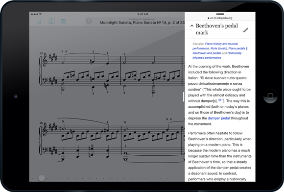
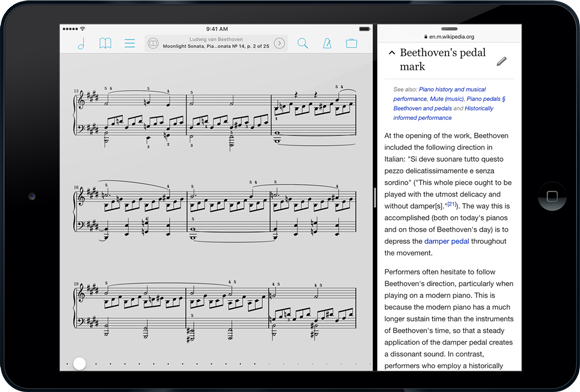
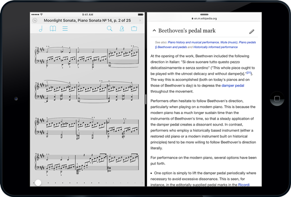
Split View
If you’re using an iPad Air 2, the brand new iPad mini 4, or once you get your hands on the upcoming iPad Pro, you’ll also be able to use Split View. With Split View you can run two apps side-by-side and work with them simultaneously. Unlike Slide Over, neither app is dimmed or inactive, so you can use them like you normally would. To use Split View, swipe from the right just like you do with Slide Over, then enlarge the window by dragging its left edge into the center of the screen. Your two apps will blur and display their icon until you let go, settling in to their respective sides of the screen.
You get a little bit of control over how much space each app takes up on the screen, but only in landscape orientation. In portrait, the app on the right gets the classic iPhone width of 320 pixels, while the app on the left gets the rest. In landscape mode, you can choose one of two options: the same 320 pixels on the right and the remaining space on the left, or a 50/50 split. Just drag the divider left or right to change which option you’re using.
When you need to focus on one app or the other, just drag that dividing line all the way to the left or right, depending on which app you want to keep. The other will be closed just like it normally does when you press the home button.
Speaking of the home button, if you press it while working in split view, iOS will close both apps but remember which one was on the right and use it in combination with whatever app you open next.
Side Effects
As it so happens, there are a few things you can do that are probably useless but fun to try anyway. First, if you’ve downloaded today’s update to forScore Cue, you can use Split View to see forScore on one side of the screen while controlling it from Cue on the other. You can also activate Console in forScore and use Safari at the same time to edit your library (it doesn’t work well—we’ve never needed to optimize the Console web editor for a mobile device, so be warned).
So now you’re a pro at multitasking on iPad with iOS 9 and forScore 9.1. Tell your friends!
September 15, 2015
| News
iOS 9 is coming tomorrow, so many of you are wondering if forScore will work properly if you choose to update. Although there were some major bugs with early beta versions of iOS 9, Apple has since fixed them and we are happy to report that we’re not aware of any compatibility issues with the current versions of forScore and forScore mini.
Of course, if you’re itching to install iOS 9 you’re probably anxious to try out all of the new features, so today we’re proud to announce the immediate availability of forScore 9.1 and forScore mini 2.1.
With forScore 9.1, you’ll be able to take advantage of iOS 9’s new Split View and Slide Over multitasking modes, an improved drawing experience (especially if you’re using an iPad Air 2), and some clever keyboard enhancements. Of course, we already did most of the work required to support these new features earlier this summer with forScore 9, so it’s exciting to be able to finally show it all off.
Both forScore 9.1 and forScore mini 2.1 include a few bug fixes and improvements like a more flexible tuning option for the pitch pipe’s tone generator, so even if you’re sticking with iOS 8 for now there’s something for everyone.
As always, these updates are completely free for existing users, so be sure to check out forScore 9.1 and forScore mini 2.1 today!