new in forScore 10.110.0
10.1
10.2
10.3
10.4
10.5
Your new “plus one”
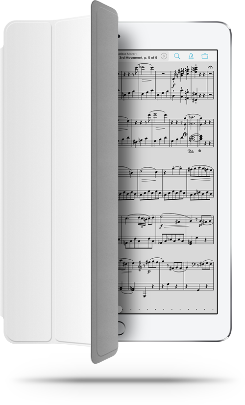
A great sidekick knows you well. They anticipate your needs, streamline your day, and keep an eye out for potential hurdles so you can avoid them. They fit your needs, not the other way around.
That’s never been more true than it is with our newest update, forScore 10.1. It takes everyday tasks even further, supercharging some and simplifying others to give you the best possible pathway to your music. It’s the most natural, powerful version yet.
Metadata
Filters
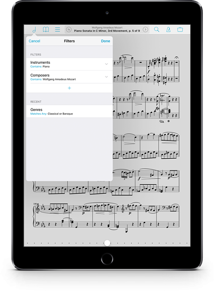
There are lots of different ways you can organize your music: add metadata like composers, genres, tags, and labels to your scores and forScore takes it from there, grouping and sorting your collection instantly and automatically.
forScore 10.1 adds a whole new dimension to this system. Now, from most score menus, you can use filters to cross-reference these categories and hone in on exactly what you’re looking for.
Choose a composer to see all of their works, then add a filter to narrow the list down to just the piano songs. Or exclude certain categories with rule matching options like “equals” and “not” (for single values) or “any” and “all” (when you’ve selected multiple values). You can even reuse recent filters with just a few taps.
It’s a whole new superpower, and the possibilities are endless.
Rating & Difficulty
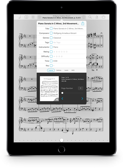
Our goal has always been to make forScore as intuitive as possible, to give musicians total control without drowning them in technicality. We don’t always get it right, and a small example of that is with the Metadata panel’s rating and difficulty pickers.
Adding a rating or difficulty value is straightforward, but removing it after the fact has always been a little less obvious: you’ve had to tap on one of the values and then drag your finger all the way to the left until none of them are selected.
Now, the “no rating” or “no difficulty” option is right there in plain view, a small “x” that seems so obvious in retrospect. Sometimes, it’s the little things that really add up to a great experience.
Annotation
Drawing
For decades, people added notes to their sheet music with pencils and not a lot of fuss (until it came time to try and erase them). Then touchscreens came along and complicated things, necessitating conceptual “modes” to clearly separate drawing on a page from turning a page. We take annotation very seriously, and we’ve spent a lot of time refining our annotation experience over the years to produce something that’s powerful, customizable, and clear. We’ve pushed the limits of what’s possible, and people noticed.
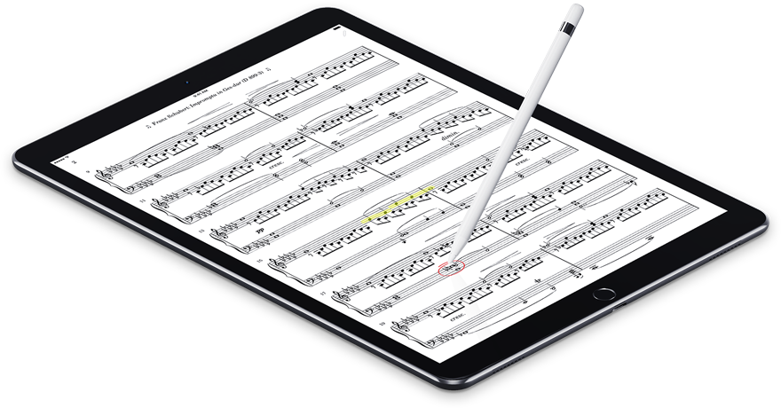
Then the introduction of iPad Pro and Apple Pencil last year changed the equation dramatically. We worked furiously to streamline the annotation experience even further, finally bringing it closer to that age-old experience by letting the Apple Pencil automatically enter annotation mode and start drawing without skipping a beat.
Now, with 10.1, we’re completing the experience with an option to automatically exit annotation mode after a short delay. No gestures or toolbars, no tapping the “done” button, just draw and move on. Modern technology, meet centuries-old ease of use.
Undo
Just like with real pencils, though, it’s easy to accidentally brush the page and make an unintentional marking. So we’ve expanded undo support to work between annotation sessions as long as you stay on the same page. Let’s see real pencils and paper do that.
Page Turners
A new option in the “Page turners & shortcuts” section of the settings panel lets you use your device to turn pages even while annotating, just like you can currently with the “previous page” and “next page” buttons in the annotation control toolbar.
Enhancements
Status: away
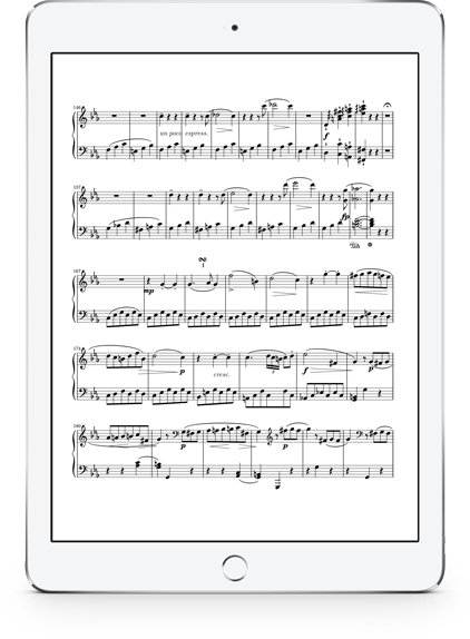
With the release of iOS 9, we worked hard to support all of the new shapes and sizes apps could be squeezed into with the new Split Screen and Slide Over multitasking modes. We banished the concept of a fixed size, and that led us straight to our next new feature: an option to hide the status bar entirely.
Some people love seeing the time at the top of the screen, or being able to check their remaining battery life with a quick glance. Others find it distracting and want the clearest possible view of their music. Now you can choose which option feels right.
iOS 10 & Swift
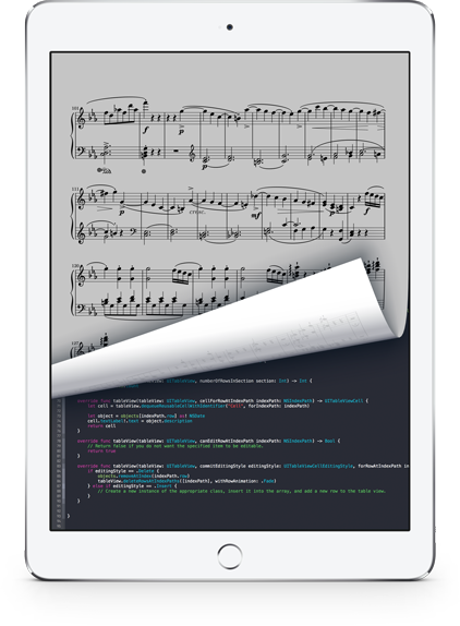
We’re not the only ones releasing a big update soon: Apple’s iOS 10 will be making its debut as well. We’ve made some adjustments to ensure that everything works just like you’d expect, and we’ve spent a lot of time editing our code and adopting all of the latest standards, conventions, and best practices.
We’ve also begun transitioning forScore’s code to Apple’s new programming language, Swift. It’s a huge task that we’re just beginning, but it lays the foundation for a whole new era of programming and there’s no chance we’d miss out on that.
You’ll never see them, but these changes add up to make forScore better and more reliable. They speed up common operations, prevent errors by design, and make our future code easier to write. They make it possible for Apple’s developer tools to understand our intentions and point out where there’s room for improvement: our very own sidekick.
Available now.
forScore 10.1 and all of these amazing upgrades are available now, absolutely free for all existing users. Get it today on the App Store, and be sure to check out our news page or use our RSS feed to follow our latest news and announcements.