We’re taking a break from this column to work on our next big thing, but there are almost two hundred features here to catch up on if you haven’t read them all. If there’s a topic you’re interested in, you can also try searching for it.
Last week we discussed the variable width effect when drawing with forScore’s annotation tools. As we mentioned, drawings become slightly bolder as you draw faster with your finger, or when you press harder with Apple Pencil.
With forScore 10.2, there’s actually a little more to the story for Apple Pencil users. Now, not only does pressure matter, but so does tilt. The closer the back end of your pencil is to the iPad’s screen, the more emphatic your drawings will be (like shading with the side of a pencil’s tip). Pressure and tilt are balanced to produce a natural effect at all times, so a hard press while holding the Pencil upright produces a similar amount of boldness as a soft press with the Pencil held almost flat against the screen.
Apple Pencil is an incredible tool and we continue to recommend it very highly—if you annotate regularly it’s the absolute best option by far. Now that forScore is using all of its sensors, it’s a perfect companion for the ultimate drawing experience.

 Our Annotation engine is the product of seven years of unrelenting work. It may seem simple to create a drawing feature, and on a basic level it can be, but there’s a huge difference between something that works and something that works efficiently, faithfully capturing all of the nuance of handwritten marks.
In forScore, drawing faster with your finger or pressing harder with Apple Pencil creates marks that become slightly larger or bolder. This effect has always been subtle, unlike with many art-focused apps (since big dramatic strokes aren’t typically useful in an annotation context), and its intensity is diminished for larger presets. Of course, there’s no perfect amount for everyone, so with forScore 10.2 we made added a “Variable Width” option to the Annotation section of the Settings panel.
The default setting, “Normal,” works just like forScore always has. If you prefer to maintain a consistent marking size no matter how you draw, choose “Off” instead. For iOS 10 users, a third option called “High” produces a more exaggerated effect—still practical and restrained, but definitely more noticeable.
In the end, all that matters is that annotation feels natural and that it effectively captures and conveys your intentions. Inflection is an important part of that, and now you can choose for yourself what that looks like.
Back when the iPad first launched, it attempted to blend the large screen and usability of a computer with greater approachability and simplicity of what was then called iPhone OS. Apple resisted the idea that a user should care or even know that the device had a file system at all, but in practice this leap was impractical for an iPad to live up to its full potential. Sometimes users want to work with the same data on their computer and their iPad, so Apple created the File Sharing panel.
Every app has its own “Documents” directory, and this File Sharing panel—buried in iTunes—gives you a way to add files to it, delete them, or copy them back to your computer. It’s a messy concession, so be sure, but its usefulness is undeniable even in the world of iCloud. Since there can be a difference between the way forScore presents your files and the way they’re actually stored on the device, sometimes it’s useful to be able to view this folder directly. Instead of managing your audio files through the music picker, your images through the stamp creator, and your CSV files through the Indexes panel, the Documents directory lists everything at once.
It can be helpful to see this information even when you’re away from your computer, so in forScore 10.2 we added a new Documents browser in the Support section of the Tools menu. It gives you the same power of iTunes’ File Sharing panel within the app itself. You can preview, delete, and share files (some actions are unavailable depending on the type of file). It’s a great way to manage your storage if your device is starting to get full, or to find and share something specific without worrying about which panel to use.
The easiest way to work with scores in forScore is by using a single PDF file for each piece of music in your collection. You can add metadata to it, use it in setlists, and share it quickly and easily.
Things get a little more complicated when you’re working with music that features several distinct parts, and even more so when using much larger compilations such as real books. In these cases, Bookmarks give you the best of both worlds: they let you turn a set of pages within one long PDF into a virtual item, so you can work with it just like you’d work with any other score in your library.
Setting up bookmarks for a long file can be a daunting task, and while we make things easier by letting you import a PDF’s embedded table of contents, not every PDF file has one. Fortunately, if your compilation is fairly standard and popular, chances are high that someone has already done the hard work for you. A quick web search can save you lots of time here. If not, creating an index on your computer can be much easier and faster than using the iPad’s virtual keyboard.
Indexes are similar to spreadsheets, most commonly in the CSV (comma-separated values) format, and in forScore 10.2 you can use these files to create bookmarks in seconds. Add a CSV file to your forScore library using any of the same methods you use to add scores, then open the bookmarks menu while viewing your PDF file. Tap “Indexes” in the top left-hand corner, then choose the CSV file you just added.
In this new panel, you’ll see a list of the values contained in each row of your index. Tap on one to map it to a standard forScore metadata field. Pick a title and starting page number (both are required) and any other metadata you want to use, skipping a certain number of header or footer rows if necessary. The arrow buttons along the bottom let you step through each record so you can make sure things look right.
When you’re done, tap “Save” and see all of your new bookmarks appear in the list. Now go use all of the energy you saved having to type in that information manually and put it where it really counts: playing your music!
After months of hard work, we released forScore 10.2 and forScore mini 3.2 this week! There are plenty of new features and improvements, so there’s tons of new material for us to explore here in our Feature of the Week series. We’ll kick things off today with a big one: templates.
This new item in the tools menu lets you create and add new PDF files to your library with just a few steps. Choose any of the built-in templates and specify a number of pages, then tap “Save” and supply a name to generate a PDF file—you can work with it just like you do with any other score in your music library: annotate, add metadata, and print or share it with colleagues.
You’ll find a blank template as well as several different styles of staff paper, but you’re certainly not limited to that default selection. Tap the + button in the Templates panel and you can select any file in your library to use as a custom template (it’s copied to a special folder so you can delete or rename the original file at any time). If a template is more than one page long, forScore only duplicates the last page when necessary, so you can create files with a title page that’s different from the rest. If you don’t need a template any longer, use a long press gesture to remove it.
It’s no replacement for a complete composition app, but when you need to jot something down in a hurry the new Templates tool is the right one for the job.
Since version 3.1 was released all the way back in 2011, forScore has included a pitch pipe that lets musicians hear a specific note. Since then it has grown to become our most flexible utility: it can be accessed from almost anywhere thanks to iOS 8’s introduction of Today View widgets, and the standalone app makes it available on all of your devices—even Apple Watch.
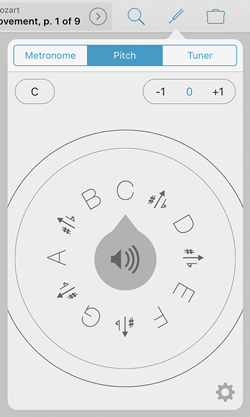
 We discussed the widget previously, so today we’ll be taking a look at the primary interface instead. The most important part of the pitch pipe is the dial which displays each note around a central speaker control. Drag the notes around in a circle until your desired note is at the top, then tap the speaker icon to hear it. You can also tap on a specific note to bring it to the top quickly.
In the top left-hand corner, tap the control to switch between C-C or F-F based on your needs. Our pitch pipe also sports a three octave range, and the controls in the top right-hand corner allow you to hear notes one octave higher or lower than normal. As you drag the dial around, you’ll notice that these controls update automatically: move the dial from C to the B just to the left of it and the octave will drop (unless you’re already using the lowest octave).
The gear icon in the bottom right-hand corner lets you change the type of sound you hear. Pick from high-quality piano or clarinet samples, or let forScore generate pure sine wave tones instead. If you pick the latter, you’ll also be able to adjust the base frequency to better suit your needs.
Easily accessible and fully-featured, our pitch pipe is just the thing when you need to find your starting note. For the complete experience, be sure to check out the standalone version (including the Apple Watch app) called Pitch, Please!
Some of forScore’s features are completely unique, while others build on well-established tools to provide an integrated solution for a common need. Like our metronome, forScore’s tuner is just one version of a utility that’s available virtually everywhere. But just because you can find thousands of metronomes and tuners on the App Store doesn’t mean that we can’t bring something unique to the table.
In the case of our tuner, its biggest strength is not that it’s built right in to forScore (an advantage that’s since been reduced by iOS 9’s fantastic split screen modes), but in its design and usability. Like forScore itself, our tuner was created to be as simple as possible while still including the specialized features that so many musicians rely on.
To use it, just open the panel and play a note on your instrument. You’ll see the name of the nearest note right at the top with a smaller number below that indicating how close your tuning is (in cents). Below that, the tuner uses two major interface elements to help you get a feel for your note as you adjust it. The needle pivots to show you if you’re too flat (left of center) or too sharp (right of center), and the sine wave animation gives you a different way of sensing how far off you are by reducing amplitude as you get closer to your note. These two animations help you work quickly and intuitively to get your instrument into shape.
Use the controls in the bottom left-hand corner of the panel to adjust the note names if your instrument uses different letters. The controls in the bottom right-hand corner let you adjust the base frequency to better fit your needs.
When you need a tuner that does everything under the sun there are plenty of great options out there for you. But for most musicians—most of the time—our tuner is the easiest, most convenient tool for the job.
Last week we learned about Links, semi-transparent dots that you can place on a page that direct you to another spot when tapped. Just like Links, Buttons are tappable dots that you can place on a page. Instead of helping you handle repeats, though, Buttons let you easily perform a wide range of different and customizable tasks with just a quick tap.
Choose “Buttons” from the tools menu and you’ll see an interface that looks a lot like the Links creator. Instead of showing you two copies of your score, however, the Buttons creator shows your page on the left and lets you customize the button’s actions on the right.
Buttons can be set up to perform one of seven major kinds of functions, each with its own customizable color:
- Metronome: start or stop the metronome, after a delay if needed.
- Tempo: change the metronome’s tempo to a specific value (temporarily overriding your saved tempo), or leave it blank to revert back to the saved setting.
- Play/Pause Audio: start or stop the currently queued audio track, if available.
- Pitch: play a specific pitch using the pitch pipe’s last-used sound bank.
- MIDI: send MIDI messages or presets with a tap (discussed in-depth here).
- Note: temporarily display a text note near the top of the screen, similar to the page-specific “notes” feature and the “remind me” option.
- Navigation: program a button to take you to the next score, the previous score, or to perform a full- or half-page turn, whichever is the opposite of your normal settings.
Many of these actions are similar to the options available in the “Gestures” section of forScore’s settings panel, but Buttons are unique in that they’re location-specific. Gestures help you do global things like open a new tab, but Buttons are suited to the kinds of actions that are more strongly connected to your music. Buttons don’t just let you change the tempo, for instance, they remind you that you should do so at a specific point in the song and they store the tempo value so you don’t have to think about it while you’re playing.
When your music requires dynamic changes like these, Buttons are there to help you prepare everything in advance, then execute flawlessly as you play with just a quick tap.
We sometimes hear from people who tried using a general PDF reader to store their sheet music before they ultimately decided to use forScore instead. There are lots of reasons why people find that a dedicated app like forScore is better-suited to the job of managing and displaying your sheet music library, but one of the biggest reasons by far is our Links feature.
It was one of the very first features we came up with, and it was the perfect demonstration of the sort of augmentation that was possible with a dedicated digital sheet music reading app. It made handling repeats far simpler, and we hadn’t seen anything like it at that point (though it’s become so ubiquitous that you’d be hard-pressed to find a sheet music reader these days that doesn’t offer something similar).
So how does it work? By marking two spots in your score—a “from” spot where a repeat is initiated, and a “to” spot where that repeat leads—you create a connection between those two areas. You create these connections in the Links panel (found in forScore’s Tools menu) which displays two copies of your score side-by-side. Tap on the page to mark the “from” position on the left and the “to” position on the right, swiping to turn pages if necessary. (Links take you to a specific spot, either on the current page or on any other page of your score.)
A blue circle is always visible on the page where you’ve marked a link’s source position, and tapping it takes you to the corresponding target position. An orange circle will appear and pulse briefly, indicating where you should begin playing. These orange spots aren’t normally visible, they only show up immediately after you activate a link. If you’re using your iPad in landscape orientation, forScore scrolls up or down as needed to get you to right place.
In short, links make repeats a lot easier to handle. They give you a quick and easy way to jump from one spot to another, and you can create as many as you need to unfurl even the most complex musical knots.
February 24, 2017
| Feature of the Week
PDF files can have certain kinds of metadata embedded within them, like a title, author, subject, or keywords. These aren’t necessarily words shown on any of the pages, but the information is there in the file ready to be used however any compatible application sees fit.
In forScore, we use most of this information to help you organize your files: the metadata panel can pull this data into its own fields, including title, author (as a composer), subject (as a genre), and keywords (as tags). But there’s one more useful type of metadata, and that’s the table of contents.
In the bookmarks menu, you can see if the current file has a table of contents by switching to the TOC view. Since a table of contents pairs titles with page numbers, you can tap on any title and be taken immediately to the corresponding page. With a little bit of work, though, you can use this information to create more advanced forScore Bookmarks as well.
To do this, tap the “import” button and forScore will use the titles and page numbers of your file’s table of contents as the titles and starting page numbers of each new bookmark. It goes a little further than that, too: forScore makes some educated guesses about where each bookmark ends. For instance, if a bookmark starts on page 3 and another one starts on page 6, forScore assumes the first one ends on page 5. It’s not a perfect assumption, but it gets you most of the way there and saves you lots of typing.
Depending on where your PDFs come from, they might have a table of contents that you never even knew about. Next time you’re looking for a particular section, a quick visit to the Bookmarks panel could save you some time and effort.


