We’re taking a break from this column to work on our next big thing, but there are almost two hundred features here to catch up on if you haven’t read them all. If there’s a topic you’re interested in, you can also try searching for it.
October 16, 2015
| Feature of the Week
MIDI, the ubiquitous musical language, has been around for decades. It has proven to be remarkably resilient despite numerous attempts to replace it with more modern alternatives. While MIDI may be almost everywhere, it’s not very approachable and most people only understand part of what it can do. For years, we got requests from our customers to add MIDI features to forScore. The problem was that every customer wanted something different, so finding ways to weave MIDI functions into forScore required balancing technical capability with practical usability.
Instead of creating a single MIDI panel that would duplicate a lot of forScore’s existing functions, we chose to reverse it and supplement some of our existing features with advanced MIDI functionality. Today, we’ll be looking at just one of those cases, with more to follow in the coming weeks.
As we discussed in our previous Devices Feature of the Week, the “Page turners & shortcuts” section of the Settings panel lets you trigger many of forScore’s functions with an external device. If you tap on a function, forScore listens for incoming signals from a variety of sources and can associate anything it hears with the selected function. When you’re using a keyboard or a keyboard-based page turner, it works just like shortcuts on a computer complete with support for modifiers like shift, alt, command, or control. If you’re using a Bluetooth Smart stylus like FiftyThree’s Pencil or an accessory like the iRig Blueboard, you can either press or press and hold a button to set up two different functions per physical control.
The process is similar for a MIDI device: tap your function, then use your device to send a signal (press a button, flip a switch—it depends on your device). If forScore recognizes and can use that signal, you should see your MIDI command appear to the right of the selected function. Now, any time you send that exact same signal, forScore will respond by initiating the corresponding feature.
There is one caveat to watch out for, however. Since forScore listens for the exact same signal, some kinds of MIDI controls won’t work reliably. Anything that senses levels of pressure, like a piano key for instance, will include a velocity value. Unless you hit that key with exactly the same amount of force each time, forScore won’t react. Other switches use a range of values, like a volume knob, and will have the same problem. Otherwise, any simple on/off control should work fine. If you’re not sure how a specific control works, consult your device’s manual.
That’s just the start, though, so be sure to check back over the next few weeks as we explore the entirety of forScore’s MIDI functionality.
Some features aren’t appropriate for all users or situations, and that’s why forScore offers Restrictions. They’re a lot like iOS’s system-wide Parental Controls but they’re specific to forScore.
In the tools menu, select Settings, then Restrictions to see which features you can disable if needed. Currently, that includes the Services panel, the in-app purchase storefront, the ability to transfer files to other forScore users via a direct Bluetooth connection, and the ability to share files using the standard iOS share sheet (this includes the ability to email or print a file, to share it with nearby devices over AirDrop, or copy it to another app that implements iOS’s “open in” protocol).
Before you can disable any of these features, you’ll need to enable restrictions and enter in a four digit passcode. Then, just turn off the features you don’t want and press the back button or tap away to close the tools popover. Now, you’ll need to type in your passcode any time you want to view the Restrictions panel or make changes, so don’t forget it!
Way back when forScore was just an idea, we made the decision to design it around the PDF file format. It’s the most ubiquitous format for documents that feature precise layouts (anything more than basic text). There are many versions of the PDF specification, but all of them include some basic information about a file like its author, subject, and keywords.
Since one of forScore’s most fundamental features is its ability to organize your music by these kinds of metadata, it made sense to connect the two dots. “Fetching” is the term we came up with to describe the process by which forScore reads a PDF’s metadata and adopts some of it when it makes sense to. This can happen automatically (if the “automatic fetching for new files” setting is enabled) or manually from the metadata panel (tap a text field and then use the “Fetch…” button just above the keyboard). In either of these cases, the PDF file’s “author” is used to fill in forScore’s “composer” field, “subject” becomes “genre”, and “keywords” become “tags.”
This all works wonderfully if your PDF files include this kind of information, and if that information is correct. Unfortunately, many scanning programs will either fill in their application name or your own as the Author, so whether or not this feature will save you time depends largely on where your PDF files come from. When used correctly, however, this kind of metadata can be a great, permanent way of tagging your files. If your forScore library is lost and you don’t have a backup, or if you’re using your files with another PDF reader, this information will still exist within each PDF file and can be easily retrieved.
Bonus tip: If you want to get really fancy, forScore can read specially-formatted keywords as rating and difficulty. Use the keyword “forScore-difficulty:2” with a number between 1 and 3, or use the keyword “forScore-rating:3” with a number between 1 and 5.
September 25, 2015
| Feature of the Week
Last year’s iPad upgrades got a mixed reception, largely due to the similarity between the iPad mini 2 and the then-new iPad mini 3. It turns out that there was a little more to the story though. The iPad Air 2, a decent upgrade as presented, actually includes one technical change that’s only now being put to use: Apple has doubled the amount of data the screen can collect from your touches.
Every iOS device refreshes its screen sixty times per second. In fact, a lot of system processes are tied to that number, so it was natural to put touch handling in that queue as well. The problem is, when you draw with your finger on a screen that’s collecting sixty points per second, your movements don’t always turn out the way they should. Sixty seems like a lot, but when you’re moving quickly some details get lost.
With the iPad Air 2, Apple doubled the sample rate to 120 points per second. It’s just that no one knew about it, because developers didn’t have access to this additional information until iOS 9’s release last week. All of the pieces had to fall into place, but now they’re here: with an iPad Air 2, running iOS 9 and forScore 9.1, your drawings will be more accurate and feel more natural.
Even if you don’t have the latest iPad, though, you can still benefit from another improvement made in iOS 9 called Predictive Touches. As the name implies, Apple’s new OS gives developers a best guess about where your finger or stylus is headed. That helps us draw the results sooner, making your drawing experience feel more responsive. And, best of all, the predicted touches are only temporary—they’re replaced by actual touches as soon as possible so your drawing accuracy doesn’t suffer.
They’re not big, banner-worthy features and they don’t really have a catchphrase, but iOS 9’s drawing improvements add up for users like our customers who rely on quick, natural annotation.
September 16, 2015
| Feature of the Week, News
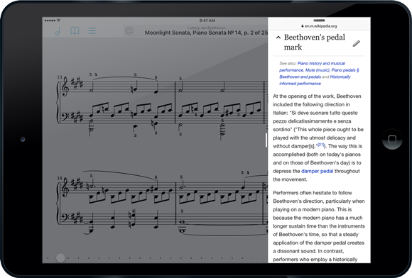
Today’s release of iOS 9 means some of you will just be getting started with new iPad multitasking modes, Split View and Slide Over. So what are they? How do they work? What silly things can you do with them? Keep reading this special Wednesday edition of Feature of the Week and you’ll soon be a pro, ready to impress your colleagues and show them how it’s done:
Slide Over
The first new multitasking mode for iOS 9 is Slide Over, a feature that lets you temporarily bring another app into view over the current app from the right-hand side of your screen. While viewing an app, just slide your finger from the right edge of the screen into the middle. You’ll see a vertical list of icons for the apps that support Slide Over, and you can tap on one to open it. This lets you do something quick like respond to a message or check a web page without closing the current app first. The main app will dim and won’t be interactive while you’re working with the second app, but you can swipe from left to right or tap on the dimmed app to dismiss the second app and continue what you were doing.

Once you’ve picked an app it’ll be the one you see each time you use Slide Over (unless iOS closes it to free up memory), but you can swipe down from the top of the screen within the Slide Over area to choose another app to use here. Apps must be updated to support Slide Over, so the list of available apps may be limited until more developers get on board. On the other hand, developers must specifically opt out of support for being the primary (dimmed) app, so you should be able to activate Slide Over from within most apps.
Slide over is compatible with iPad Air or newer, iPad mini 2 or newer, and the new iPad Pro (once it’s released this fall).
Split View
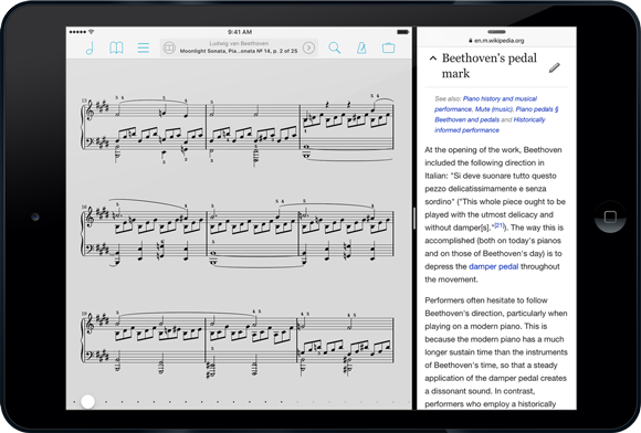
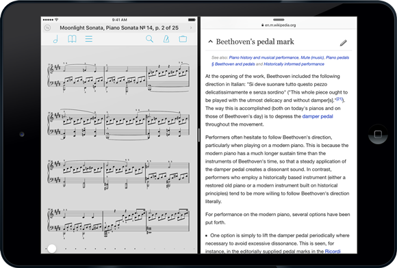
If you’re using an iPad Air 2, the brand new iPad mini 4, or once you get your hands on the upcoming iPad Pro, you’ll also be able to use Split View. With Split View you can run two apps side-by-side and work with them simultaneously. Unlike Slide Over, neither app is dimmed or inactive, so you can use them like you normally would. To use Split View, swipe from the right just like you do with Slide Over, then enlarge the window by dragging its left edge into the center of the screen. Your two apps will blur and display their icon until you let go, settling in to their respective sides of the screen.

You get a little bit of control over how much space each app takes up on the screen, but only in landscape orientation. In portrait, the app on the right gets the classic iPhone width of 320 pixels, while the app on the left gets the rest. In landscape mode, you can choose one of two options: the same 320 pixels on the right and the remaining space on the left, or a 50/50 split. Just drag the divider left or right to change which option you’re using.

When you need to focus on one app or the other, just drag that dividing line all the way to the left or right, depending on which app you want to keep. The other will be closed just like it normally does when you press the home button.
Speaking of the home button, if you press it while working in split view, iOS will close both apps but remember which one was on the right and use it in combination with whatever app you open next.
Side Effects
As it so happens, there are a few things you can do that are probably useless but fun to try anyway. First, if you’ve downloaded today’s update to forScore Cue, you can use Split View to see forScore on one side of the screen while controlling it from Cue on the other. You can also activate Console in forScore and use Safari at the same time to edit your library (it doesn’t work well—we’ve never needed to optimize the Console web editor for a mobile device, so be warned).
So now you’re a pro at multitasking on iPad with iOS 9 and forScore 9.1. Tell your friends!
September 11, 2015
| Feature of the Week
The Setlists tool is one of the most important features of forScore, and when you’re playing in a group you need to make sure everyone is on the same page. From the first view of the Setlists menu, tap “Edit” and select one of your setlists, then tap “Share” to see a long list of options. Here’s what each of them does:
Text List
If you’re working with colleagues who don’t have forScore, a text list might be the easiest way to go. It provides a numbered list of each of the titles in your setlist so others can re-create it on their own device or with good old fashioned paper.
Setlist Only
When your colleagues use forScore, sharing setlists with them is a lot simpler. Just choose this option to send a forScore-specific .4SS file to them and their copy of forScore will attempt to match up the titles in your setlist with files they already have. It’s an extremely lightweight way to share a setlist if you know that someone already has all of the PDFs they’ll need.
Include Scores
If you’re not sure that your colleague has all of the PDFs in your setlist, you can share a .4SS file just like the previous option but with all of its items included as well. Scores are sent as-is, and bookmarks are exported first so you’ll only be sending the necessary pages.
Include Scores & Extras
Like the previous option, this will send a .4SS file to your fellow forScore user(s) with all of its items included. Additionally, each item will include extra information like editable annotations, metadata, and more.
Merged PDF
Another simple option is to create one long PDF file that contains all of your setlist’s items in order. It’s a simple way to share a setlist with your forScore friends without adding a bunch of new files to their library, and it’s also a great way to share a setlist with anyone using a different app or device.
Annotated Merged PDF
Just like the previous option, but with annotations hard-coded onto each page. These annotations cannot be changed, even by forScore users, but they’ll look similar in other apps, on other devices, or printed out on paper.
That’s a lot of different ways to share a setlist, and people use every single one of them! Once you’ve picked an option, you’ll be able to send your setlist via email, AirDrop it to nearby iOS devices or Macs, or open it in another app. And don’t forget, you can always use the Services panel to upload a 4SS file to your Dropbox, Box, or other cloud account. So next time everyone is scrambling to rearrange their songs, save them some time and effort!
September 4, 2015
| Feature of the Week
One of iOS’s less intuitive icons is the reorder control, used primarily when editing a table view. It’s a stack of three horizontal lines, similar to the often-disparaged hamburger menu (but different in its functionality). In a table view, you tap and hold this control for a moment, then drag to move the item up or down.

Although it may not be the most obvious icon, we always try to use existing patterns when designing our own interface. That’s why the annotation bar, which covers the top portion of the page, features a similar control on either side. If you need to annotate here, just touch one of them and drag up or down to move the bar out of the way. Unlike table views which also use the swipe up and down gestures to scroll, you don’t have to tap and hold for a moment—just touch and drag to put the control bar wherever you like.
With iOS 9 right around the corner, we’re busy putting the final touches on updates to forScore and forScore mini. So today, a very quick feature of the week:
PDFs are great for a lot of things, but your music might come from a lot of different sources and it can be a pain to convert everything to the right file format before adding it to your music library (especially when you’re in a hurry). One cool feature of forScore is its ability to turn most text files into PDFs automatically. Just add the .doc, .docx, .txt, or .rtf file to your forScore library using any of the many different ways available and… that’s it. It’ll turn into a PDF file and be available in your forScore library just like any other file. See, we said it’d be quick!
Lots of things that make sense about paper don’t necessarily make sense once you transition to a digital sheet music collection. Margins, for instance, are an especially big nuisance on a device with a smaller screen than a standard sheet of paper. Page numbers are another good example: not all physical copies start on page “1”, and blank pages or introductions can throw everything off. Your digital copy may not even include those pages at all.
For these situations, the metadata panel includes a field called “page number” that allows you to change how forScore refers to each page in the title bar along the top of the screen and when using the seek bar along the bottom. Set this value to 3 for a particular score, for instance, and forScore will call the first page of that score page “3”. Now, you’ll always be on the same page as your less savvy colleagues.
Some features are flashy and immediately obvious, but others work in the background to make your overall experience better. New this week in forScore 9 is a smarter page rendering system that saves you time by caching the first page of your most commonly and recently viewed scores.
When you open a score from the menu or flip to it from another song (in a setlist, for instance), you’ll be starting with the first page. The amount of time it takes forScore to render that page depends a lot on how big or complex your PDF files are and how powerful your iPad is, but when you’re working with lots of files that waiting time can really add up.
Now, after forScore renders your page the first time, it’ll save it and keep it as long as it can without taking up too much of your device’s free space. Each time you reopen that file, forScore will check a few things to see if the cached page is still valid and use it if possible, potentially turning seconds of delay into a virtually instantaneous process. It’s efficient, self-monitoring, and totally transparent so you can simply focus on playing and let the technology do what it does best.
