We’re taking a break from this column to work on our next big thing, but there are almost two hundred features here to catch up on if you haven’t read them all. If there’s a topic you’re interested in, you can also try searching for it.
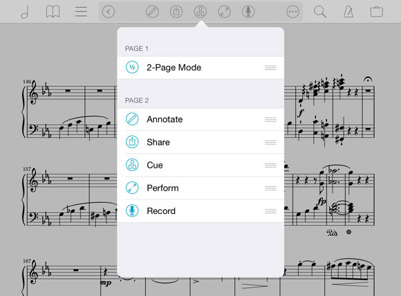
As forScore has grown, the number of tools available to musicians has increased dramatically. With forScore 7, we made it easier to quickly access some of the most commonly used tools by adding a second page of buttons to the title display:

You can swipe or tap the arrow button to move between pages, but there’s more here than meets the eye. On the second page, the ellipsis (…) button lets you rearrange the tools and put the ones you use most often on the first page for quick access.
The first page has two spots available for buttons—one on the left of the title text, and one on the right. If you have less than two items set up to be visible on page one, an arrow button takes the right-hand spot, making it easier to switch between pages. Everything else is available on the second page.

So, if you recently upgraded from forScore 6 or earlier only to find that the perform button had disappeared (like a recent app store reviewer did), now you know how to get it back.
Bonus tip: we can’t respond to reviews. We hate having an easy answer and no way to tell a frustrated customer about it, so if you ever find something to be unintuitive or different from an earlier version, just ask us!
One of the most popular features of forScore is the ability to link an audio track to a particular score in your library. Open the score, and the audio is queued up automatically, ready when you are.
There are a few different ways to control audio playback: you can use gestures, keyboard/page turner shortcuts, or you can use the controls in the media box at the bottom of the screen. The media box appears and disappears with the rest of forScore’s controls when you tap the center of the screen, but for instant access from anywhere be sure to try forScore 8’s “Always show playback controls” option in the settings panel.
When this option is enabled, the media box will still appear and disappear when you tap the screen, but the play, pause, and rewind controls will stay put. They’ll even turn partially transparent so they’re visible without completely blocking the page.


With iOS 7’s stark redesign, color became a very important part of an app’s design. In many ways it’s the most important part, so picking the right shade is no simple matter.

For some, though, an app’s color can be more than just a preference—it’s an obstacle. Color blindness can make forScore’s controls almost indistinguishable from other information on the screen, so with version 8.0 we added the ability to customize this color. Even if you have no trouble identifying controls, you can still change the color to suit your preferences, mood or even your wardrobe. There’s no wrong color (except white—don’t try white or you won’t be able to find anything).
In the Settings section of the tools menu, under Accessibility, select the “Tint color” entry to pick the color that works best for you.
Poking at a screen may have once seemed unnatural, but today we spend a huge amount of time tapping, sliding, and pinching at slabs of glass. It’s a natural input method, and what it lacks in precision it makes up for with things like gestures. Gestures allow  your device to interpret unique motions, and they work best when they’re location-independent; swiping anywhere on the screen or tapping within large regions to turn pages is much easier than trying to move a slider or tap a button.
Of course, the problem with gestures is that you can’t see them and you don’t always know they exist. There’s one particular gesture that’s so important and frequently used that it’s scary to hear from the occasional customer who still doesn’t know about it: the long press or tap-and-hold gesture that activates annotation mode by default. (Friends don’t let friends use the tools menu to annotate.)
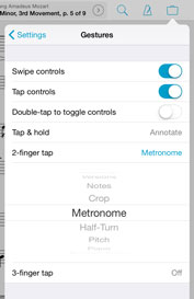
In fact, forScore has three gestures beyond the standard swipes and taps used to turn pages. The long press, a 2-finger tap, and a 3-finger tap. The latter two don’t do anything by default, but all three of them can be customized in the “Gestures” section of the settings panel.
Music publishers had one job for a long, long time: print music on paper and sell it. But what made sense for printed products just doesn’t make sense on an iPad, and the Rearrange tool’s split function is just one of the ways we’ve helped musicians drag their sheet music into the 21st century.
 Rearrange is a great tool that lets you duplicate and move pages around within a score, but it’s also a great tool for splitting one file into many: tap the circled slash (/) icon at the bottom of any thumbnail image to create a new section starting with that page. When you do, you’ll see a dividing line appear between your two sections, and you can use the X button to put them back together. You can continue working with your file, duplicating, deleting, and moving pages—you can even move pages between sections.
When you’re done, use the “Save As…” button and enter in a name to create separate, sequentially-named files. Now, you can tag, sort, and search for pieces independently no matter which book they came from.
iPads are great for saving space and taming stacks of paper, but their screen size really only lets you read one or two pages at a time. When you need to work with a few different pieces at once, tabs help you spread out a little and give you the breathing room you need.

When you’re viewing a quick peek popup or the thumbnail preview of your item in the metadata panel, you’ll see a plus symbol in the bottom right-hand corner of the page. Tap that symbol to keep your current score open in one tab and open the new one in another.
Now, you can tap to switch scores without losing your place. And, if you’re using a setlist or the “flip between scores” setting is on, each tab will maintain its own queue. The Tab bar is hidden by default, but if you find yourself using it often you can change that by enabling “Always show tab bar” in the settings panel.
Five years and counting, forScore has grown a lot since it was first released. Many updates have introduced major new features, and if you weren’t a forScore user at the time or didn’t have a chance to read the release notes, you may have missed some of them.
 With that in mind, we’re introducing a new series of posts that aim to highlight some of forScore’s more hidden or niche capabilities. They may be completely new to you, or they may be features you noticed but never checked out. Of course, we’re always happy to take requests—if there’s a feature you use that no one else seems to know about, let us know!
Today, we’re going to take a look at an easy one: Quick Peek. When you’re using forScore’s global search panel or viewing a list of files in the scores, bookmarks, or setlists menus, tap and hold an item with two fingers to preview it. You can tap to open it, tap away if it’s not the right thing, or tap the plus button in the bottom corner to open it in a new tab.
Of course, if you’ve never used tabs before, well, that’s a topic for another week!

