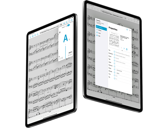
Today we’re incredibly proud and excited to announce the release of forScore 14, the latest major update to our sheet music reading app for iPad, iPhone, and Mac.
After a decade of evolution the metadata panel and tuner have been completely replaced, rewritten from scratch to be more flexible, modern, and powerful. Apple Pencil hover detection supercharges the annotation experience, secondary windows get far more capable, and forScore sports a brand new icon with several alternatives and older versions. With forScore Pro you can do even more like wink to turn pages, and you can now try out Pro features with a 30-day pass that doesn’t auto-renew. All that and more.
Thanks as always to our beta testers, and to all of you for continuing to support forScore and allowing us to keep providing significant free updates like this.
Available now for iPad, iPhone, and Mac

Today we’re incredibly excited to give you a sneak peek at our latest major update to forScore, version 14. This big update features significant updates to some of forScore’s most important components, including a total rewrite of the metadata panel that focuses on flexibility and opens up all sorts of possibilities for the future. This version also includes an all-new tuner, significant annotation enhancements thanks to Apple Pencil hover detection (available on M2 iPad Pros), another huge push forward for secondary windows, and more.
There’s one last thing—a few, actually. After thirteen wonderful years, it’s time to change things up and introduce an all-new forScore icon. There are alternate versions available to forScore Pro subscribers, including a beautiful icon designed by the legendary Matt Skiles. Of course, the older icons are still available so switching back is easy if you prefer the classics.
forScore 14 will be released later this spring, but you can try it out for yourself today by becoming a beta tester. Otherwise, be sure to check back soon as we put the final touches on this incredible update.
forScore 14 Sneak Peek

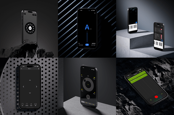
Today we’re happy to announce major updates to our Music Box apps and two minor updates to Nocturne and Piano with Friends. These free updates involve six apps spanning three platforms: it’s a huge batch of updates so let’s jump right in!
• A complete rewrite of our tuner using SwiftUI for a beautiful native experience across all platforms, TuneWave offers improved audio analysis presented with an even easier to read design. It features the ability to adjust the microphone’s input level for better results depending on your instrument and surroundings, includes a lock screen widget for easy access, and it comes bundled with a watch app for the first time ever (for no additional fee). It’s the biggest update to TuneWave ever, and we can’t wait to hear what you think.
• Pitch, Please! is now called Onyx and sports an updated design with four themes (two of which support light and dark modes) and an updated screen widget for instant access.
• Beat Keeper has been renamed as well: Modus is our new metronome and features a lightly updated design and minor improvements that’ll keep the beat going no matter what.
• Featuring a new split view layout for menus and sepia mode for the first time ever, forScore’s remote control app Cue is ready for the perfect duet.
All of these updates (and the minor updates to Nocturne and Piano with Friends) feature brand new icons, several alternates, and the previous versions in case you prefer them. These updates are free and all available now for iOS, iPadOS, macOS, and watchOS, so be sure to check them out today!
Justin recently sat down with Philip Rothman and David MacDonald for the Scoring Notes podcast to talk about forScore’s origin, evolution, and the principles that guide its development. Check it out by searching for Scoring Notes within your preferred podcast player, or visit the Scoring Notes blog to read the episode description and give it a listen!
Hi, I’m Justin, and I make forScore (more on that in a moment). Thanks to ongoing controversy at Twitter, a decent number of forScore users have started migrating over to other services. I’ve sparingly maintained a forScore account on Twitter for some time, and I just started one on Mastodon. I plan to experiment a bit, but you can generally expect the same thing from either account: it mostly serves to get the word out about the biggest news and updates concerning forScore and its sibling apps and isn’t regularly monitored for responses or equipped to handle support requests. If you prefer, you can also use this site’s RSS feed to see all news posts.
So that’s the update, but let’s back up a bit—who is this fellow and what happened to the rest of the company? Due to a number of important but boring reasons, I started using the royal “we” to voice all forScore communications. It was a necessary decision back in 2010, and it’s a hard habit to break. But the truth is that I created forScore and have been its sole developer ever since. I also handle pretty much every aspect of running the business and making apps except for support, which I entrust to my helpers.
Moving to a new social network gives me an opportunity to revisit how I approach talking about myself and about my work, so I’m trying to be more singular and authentic going forward. If you’re interested in learning more about me personally and don’t mind unvarnished opinions, feel free to follow me at mastodon.social/@ambulephabus (I don’t expect to be on Twitter for the foreseeable future). Just know that I won’t be ‘on the clock’ in that personal arena and will not be engaging in topics or questions that cross the line into business.
I just want to say, personally, thank you for your support over the years. Your passion has kept me going all this time and I sincerely appreciate it. I look forward to becoming a stronger part of this community very soon.


