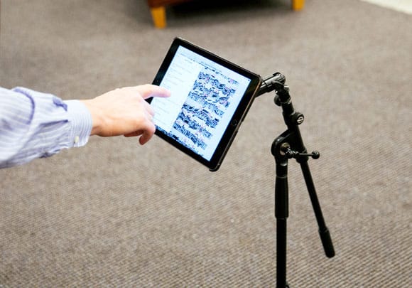
This Sunday’s print edition of the New York Times will feature an article discussing the shift from paper to digital sheet music, but a version of the article is already available online. We were interviewed for the article, and while none of our comments made it into the final piece, it’s a great look at the transition and especially the impact it can have on annotation.

 Today we released forScore 9.4 and forScore mini 2.4, kicking off the start of what’s sure to be a busy summer for us. We’re working hard on a big new update and, with Apple presumably set to announce and start publicly testing iOS 10 next month at their annual developer’s conference, there’s a lot to get excited about.
Of course, it takes a lot of work to refine a beta version and turn it into something that’s ready for release. Often the only way to find and fix bugs and usability issues is to get it into the hands of as many people as possible. That’s why we use TestFlight—Apple’s beta testing service—to work through those problems. Beta testing is more than just getting a sneak peek at new features and updates, it requires attentive and communicative users who are passionate about helping to make forScore the best app it can be. If you’re up to the challenge, consider becoming a beta tester. Our beta testers provide invaluable feedback and their participation is sincerely appreciated.
Today we’re proud to announce the immediate availability of forScore 9.4 and forScore mini 2.4. These updates includes some new enhancements designed to improve usability in two key areas:
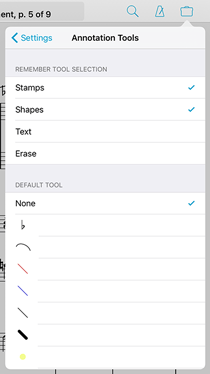
First, we’ve added a new section in forScore’s settings panel called “annotation tools” that gives you more control over how annotation mode saves your last-used tool or preset.  Choose which tools can be saved between annotation sessions and which should not, or specify one particular drawing preset that will always be active every time you begin annotating. The new settings are available for all devices, but should be especially helpful for users with Apple Pencil and forScore’s live annotations enabled.
We’ve also made it easier to download scores from a cloud service directly to a setlist. Either tap and hold an item or use the “Edit” button to select multiple items and then tap and hold the download button in the toolbar. Or, if you’re using iOS 8 or higher, you can also swipe left over an item and select the new “Download…” option. Once you do, you can choose to download the item(s) to your library like you normally would, download them to the current setlist (if you’re playing or viewing one), or download them to any setlist in your library.
These specific enhancements really boost productivity in key areas, and we think they’ll make a big difference. Thanks as always to our customers—and especially our beta testers—for helping us continue to make forScore the best app it can be. These updates are free for all existing users and still just $9.99 and $6.99 (USD) for newcomers, so be sure to check them out today!
Over the past six years, we’ve seen several different companies bring page turners to the market and continue to innovate with firmware updates and new models. From the original versions to their modern counterparts, each company has tried to balance portability, reliability, power, and software connectivity in a variety of different ways. The latest entrant is IKMultimedia’s iRig BlueTurn, and it’s a solid device that strikes a good balance between each of the tradeoffs found with its competitors.
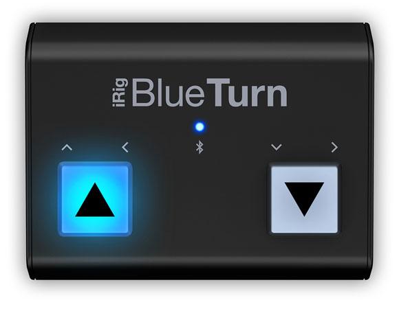
The BlueTurn looks a lot like half of IKMultimedia’s iRig BlueBoard, featuring two of the same rubberized backlit pads that are completely silent and have a different feel than the more traditional pedals of most other devices. Unlike the BlueBoard, which was designed more for MIDI functions and features its own companion app, the BlueTurn is more like the other keyboard-based page turners on the market. It sends standard up/down, left/right, or page up/page down keys—all of which work with forScore without any additional configuration.

It uses the Bluetooth Smart standard (a.k.a Bluetooth LE, Bluetooth 4.1), making it incredibly power efficient. It runs off of two AAA batteries that can be quickly replaced in a pinch, unlike other page turners that rely on built-in, slowly rechargeable batteries. You’ll need a Bluetooth Smart-capable device to use the BlueTurn, and every iPad except the iPad 1 and 2 will work.
There are other Bluetooth Smart devices out there that are compatible with forScore, including the larger BlueBoard, but their connection must be micromanaged from within forScore’s Devices panel. The AirTurn PED requires its own SDK and uses its own interface to manage the connection, and when things go wrong these extra steps can be a pain. The BlueTurn, on the other hand, connects like most older page turners—through the Settings app. Setup is straightforward and reliable, and once it’s done you shouldn’t have to think about it ever again.
The biggest downside to the BlueTurn is that iOS disables the virtual, on-screen keyboard when it’s connected (just like Airturn’s BT- series, PageFlip’s Cicada and Firefly, and the Footime page turner do). You can toggle the keyboard by pressing and holding the left pad for three seconds, but this extra step is definitely something avid users of forScore’s text annotations and search features should be aware of.
Beyond that, the BlueTurn works just like you’d expect. Press the right button to turn the page forwards, and the left button to turn backwards. And at $69 (USD), it’s a good option for musicians who don’t need extra pedals and don’t rely heavily on typing.
Pros:
• Bluetooth Smart technology provides great battery life
• Batteries can be replaced quickly
• Backlit pads are easy to see in dim environments
• Connects on a system level via the Settings app
• Works out of the box, no need to adjust “modes”
Cons:
• Requires additional steps to use the on-screen virtual keyboard
• Incompatible with iPad 1 and 2
• No auxiliary ports for additional pedals
Today we’re happy to announce the immediate release of forScore 9.3.2 and forScore mini 2.3.2. These updates reduce the smallest possible size for drawing presets and stamps (great for iPad Pro), and they also include a variety of important bug fixes. Most notably, we’ve corrected an issue with Dashboard occasionally underreporting statistics, we’ve resolved some minor interface issues in annotation mode, made improvements to the Groups service’s syncing logic, and fixed an issue when rearranging setlists. That’s just the start, though, and while bug fixes may not be flashy, these small changes all add up to make your forScore experience even better.
We’re also releasing Pitch, Please! 2.4 which is now a universal app with support for iPad and the new Split View and Slide Over multitasking modes. This version also allows for a much greater range of tuning options when using the “Tone” sound option, and improves graphics quality and animations, so be sure to check it out today!

Next month Chicago-based Fifth House Ensemble will be teaming up with composer Austin Wintory to premiere an original, interactive live performance of his Grammy-nominated score for the video game Journey. The game and its soundtrack have both been highly praised and incredibly popular, so it’s no surprise that their Kickstarter project was funded in just two hours. It has since reached over four times its goal, and with over three weeks left it’s sure to go even higher so be sure to check it out while the limited rewards are still available.
We were excited and honored to hear that they’ve chosen to use forScore during their performances, and they’ll be using Cue to stay in sync as they play from their iPads. Although we aren’t involved in the project at all, we think forScore is a natural fit for such a unique experience and trailblazing game.
As we head into this holiday season we wanted to take a moment to thank our amazing customers for a great 2015. It’s been quite a year, and none of it could have happened without your support and feedback.
We celebrated an amazing five years of forScore, taking a look back with a unique retrospective. We debuted our first service, Groups, allowing one user to easily manage music and setlists for their colleagues. This summer we released forScore 9, bringing incredible enhancements like Buttons and Dashboard, and with forScore 9.1 we added support for iOS 9’s new Split View and Slide Over multitasking modes. Just a few weeks ago now, Apple finally released the hotly anticipated iPad Pro and Apple Pencil, and our latest updates have taken full advantage of the powerful new hardware. We were even featured in Apple’s retail stores, on a giant banner and on every demo iPad Pro!
Now that the year is winding down and some lucky people are unwrapping their new iPads, we want to make sure people know about forScore and help them decide if it’s right for them. Word of mouth is huge, of course, but App Store reviews help a lot too. Unfortunately, every time we update forScore those ratings and reviews disappear, and we update forScore a LOT (over a hundred times so far). We don’t prompt our customers to review the app after every update because we know how frustrating that can be, but if you’re enjoying using forScore and want to help us reach an even bigger audience, please consider writing or updating your review.
And finally, we wanted to take a moment to remind everyone that apps make great gifts too! They’re perfect for last-minute shoppers and really help people put their iPads to full use. (You can even schedule them to arrive at a specific date and time if needed.)
Thanks again for all of your support, and your passion. We love making forScore better, and we can’t wait to see what 2016 will bring. Happy holidays!
We’re very excited to announce the immediate availability of forScore 9.3, a big update that seriously enhances the annotation experience. For users with an iPad Pro and Apple Pencil, you’ll now benefit from support for pressure sensitivity and you’ll even be able to annotate at any time by simply drawing on the page (no need to enter annotation mode first!). We’ve also heavily optimized our annotation engine for today’s most sensitive devices, providing twice or even four times the detail without slowing you down. Finally, we’re adding a way for users with page turners or certain other hardware accessories to use links and buttons without touching the screen. You can learn more about all of these features in our recent Sneak Peek article.
As always, forScore 9.3 is a free update for all existing users and still just $9.99 (USD) for newcomers. These improvements will also be coming soon to forScore mini with our 2.3 update, so keep an eye out for that. Special thanks to all of our beta testers who helped us put the final touches on this complex update—we sincerely appreciate it.
A little over a week now, we had our first chance to use Apple Pencil with forScore and came away impressed by the automatic palm rejection technology. Since then, we’ve managed to get our very own Pencil and have been working furiously over the past few days to take full advantage of its unique technologies and to tackle some issues we hadn’t seen during that first demo. Today we’re ready to give you a sneak peek at forScore 9.3 and some of the changes we’re making.
First, we’ve spent a ton of time working to make forScore’s annotation engine even faster. As of iOS 9, newer iPads deliver twice as much drawing information and iPad Pro with Apple Pencil delivers four times as much; this provides greater detail but requires more time to render. As soon as we started using Pencil we noticed some slowdowns, especially when erasing, drawing longer marks, or when using larger drawing presets. For a system as highly optimized as ours is, quadrupling performance is a huge undertaking but we’re always up for a challenge and after lots of late nights we’ve significantly improved things. Best of all, these optimizations will benefit all forScore users, not just those with the latest hardware.
If you’ve got an iPad Pro with Apple Pencil, though, you’ll get some other nice big upgrades. For instance, you can now start annotating by simply drawing on the page with Apple Pencil—there’s no need to enter annotation mode first. Once forScore detects Pencil input, it’ll activate annotation mode automatically and draw your marks without missing anything. Annotation mode stays on so you can undo any mistakes, switch tools, and save or cancel your changes. This works everywhere except when you’re using two-page mode in landscape orientation. We’ve also added support for Pencil’s pressure sensitivity, so your drawings will look a little more natural and nuanced.
Finally, we’re adding a feature we’ve spent a lot of time trying to figure out: you can now use links or buttons with your page turner, keyboard, MIDI controller, or Bluetooth Smart device. There are two new options in the “Page Turners & Shortcuts” section of the settings panel called “Select Control” and “Activate Control.” The first allows you to move focus between any of the currently visible links or buttons on your page, and the second simulates a tap on the currently selected control. You can also skip the first step to immediately activate the first (or only) control on the page.
We’re excited to deliver all of these new features and enhancements with forScore 9.3 just as soon as it’s ready, and our beta testers are already hard at work looking for bugs and sending us their feedback. We’re hoping to release it in the next few weeks, so stay tuned!
Either we missed this last week at the Apple store or they just weren’t up yet, but forScore is being featured on one of the banners at the retail stores that use them. The image is part of Apple’s holiday gifts marketing series, and more can be found on their website. Check it out below, and special thanks to twitter user @RealAppleNerd for letting us know!

