Back in February we gave you a sneak peek at an upcoming service called Groups. We’ve been working incredibly hard to get it ready, and our beta testers have been both patient and invaluable during this long process. We had mentioned that forScore 8.2 and forScore mini 1.1 would include this service, but these updates actually include a whole lot more: they fix a ton of minor bugs and restructure some of our code to comply with Apple’s latest best practices.
Although forScore mini 1.1 was approved last month without any issues, forScore 8.2 has been rejected twice now because of the Groups feature. To be clear, both updates have been thoroughly tested and we’re ready to release them. The hangup is specific to the review process and we don’t believe it would impact our users at all.
This is perhaps the biggest update we’ve ever done, so it’s not surprising that there are some hiccups and we don’t fault Apple at all for wanting to ensure that everything works properly. It does put us in a tricky spot with updates, however, and the end result is that we’ll be releasing forScore mini 1.1 with the new Groups service and forScore 8.2 without it.
We have a few other updates in the works and it no longer feels right to hold those updates back because of this sticking point. We’re going to push ahead and let our customers benefit from the huge amounts of work we’ve done while we sort out these technicalities with Apple. It’s not ideal, but that’s how this process works and we know the end result will be worth it. Thanks for your patience, and—as always—for your support.
April 1, 2015
| In Depth, News
Five years ago this month we released forScore 1.0, and with a hundred updates since then it’s easy to forget where it all started. That’s why we’ve put together a special retrospective to celebrate our journey so far and to look back at those incremental changes as part of a larger story. Whether you’ve been a loyal forScore user from the start or you just recently discovered it, you’ll be surprised to see how much things have changed.
We say it often, but it’s always true: we couldn’t do it without you. The support and feedback of our customers has always been our greatest asset, and we can’t thank you enough. Here’s to five years so far, and to the next five!
Our new Groups service is coming soon, and thanks to Apple’s recent acquisition of TestFlight, we’ll really be able to put it through its paces. Unlike previous betas, which were limited to just 100 devices (including our own development devices), Apple now allows up to 1000 people—not just devices—to test our apps and give us helpful feedback on stability, design, and workflow. That’s where you come in!
If you’ve helped us beta test forScore in the past, you’ll be automatically moved to the new system and will receive an email when the next test version is ready. If you haven’t helped us previously, you can sign up here. Since we’re testing our new Groups feature, it helps if you and your colleagues decide to sign up together.
 Beta testers are a huge part of app development, and without this invaluable feedback our updates would be much less frequent and meaningful. We think that this new system will really help us take forScore to the next level and we hope that you’ll consider joining our team. It’s not always glamorous, but it’s what goes into making forScore the best app it can be.
Today we’re very excited to give you a sneak peek at something we’ve been working on for over six months now, coming this spring to forScore and forScore mini. It’s called Groups, and it’s a brand new service that lets you automatically share read-only copies of your music and setlists with colleagues. It’s the easiest way to keep everyone on the same page, no matter where you are.

What it does
Many musicians work in groups, and sending PDFs back and forth or rearranging everyone’s setlists at the last minute can be a huge hassle. Now, as a group manager, you’ll be able to assign specific scores and setlists to your group. As you work, changes will be uploaded automatically and efficiently in the background. Your colleagues can join your group and, once you’ve approved them, will receive updated scores, metadata, annotations, and setlists even if they’re miles away.
How it works
Groups is built on top of CloudKit, so there’s no additional account to create or separate system to use. As long as you’ve set up a free iCloud account, you’ll already be logged in and ready to use Groups. Since we’re securely sharing information between iCloud users, your group’s files won’t count against your personal storage limits, they’ll count against ours.
CloudKit is a new technology and there are a lot of important details that we just don’t have yet, such as how much Apple will charge developers for exceeding their complimentary quotas. Because of this, Groups will be a paid service and we’re taking a conservative approach to rolling it out. Although anyone can become a member of a group, a monthly subscription will be required to create and manage your own groups. Once you do, you’ll be able to share up to 250MB of content with up to 10 group members, and we expect these limits to increase over time.
What’s next
We think Groups will be a fantastic new tool and we can’t wait to show it to you. We’ll be beta testing it and a few other tidbits in forScore 8.2 and forScore mini 1.1 over the next few months, so if you’re interested in participating please let us know.
Today our app TuneWave was featured in The New York Times! It’s on page B9 of many print editions and a version of the article is also available online. We’re very happy to see our tuner app in the spotlight and we’re grateful to the Times for considering us.
When we introduced our in-app purchase storefront back in 2012, we knew it had the potential to address the needs of our users, artists, and music publishers alike. We knew that by combining the simplicity and ubiquity of standard PDF files with forScore-specific features and enhancements, we could provide a fantastic experience without locking people in.
Our customers could quickly and easily access popular music perfectly optimized for the iPad (and would gladly pay for it). Artists could provide a much more personal product by including their own notes and annotations (we’ve had conversations with a number of musicians over the years looking to do just that). Publishers, of course, could benefit from the incredible popularity of the iPad and give their customers the chance to enjoy sheet music on their own terms.
We’ve had great support from our first few partners including Oregon Catholic Press and Janet Lanier, but our talks with major music publishers over the years have repeatedly stalled. From accounting and formatting requirements to more fine-grained logistical questions, somewhere along the line we meet institutional hesitation. Originally, the biggest sticking point was our choice to not use DRM (Digital Rights Management) since we believe such technologies most often hinder legitimate usage and make customers feel like criminals. Eventually it became clear that this wasn’t something we had enough leverage to influence and we designed a DRM system for publishers to use if they choose to. Yet here we are in 2015 and we still get emails from customers asking why our selection is so limited and if we’ll be adding more music soon.
Ultimately, this is up to the music publishers. They’ve shown that they understand the importance of making their music available on the iPad: many of them have their own apps, though the music they sell is viewable exclusively within their app. We know our customers don’t want to have to remember who supplied the music, switch apps, and then find it and play it. They want to use the music reader they prefer, and they want to have their entire collection available to them at once.
If you’re a forScore user who wants to see more music in our storefront, consider getting in touch with the publishers who sell the kinds of music you’re eager to buy and let them know. As a small company, there’s only so much we can do to convince them. If customers start giving them constructive feedback, they’ll be much more likely to listen.
If you’re an artist, consider the kind of experience you can offer through digital music that you could never offer with paper. Your music could be enhanced, brought to life, and made available to even more musicians with our powerful accessibility tools like Reflow. These musicians might never be able to play your music otherwise.
Finally, if you work for one of these publishers, please contact us. We know we have a lot to offer, and we can’t wait to work with you.
Today we’re very excited and proud to announce the release of forScore mini, the complete forScore experience for iPhone and iPod Touch. It’s been a long process and an incredibly rewarding one, and the final result is a relentless pursuit of the mission forScore started over four years ago: to remove barriers between musicians and their music.
Now, with your entire repertoire in your pocket and the world’s incredibly diverse library of music just a few taps away, there’s no doubt forScore mini fulfills its mission and significantly broadens the variety of ways musicians can benefit from digital sheet music. The music reader that so many people love and depend on every day is now more accessible and versatile than ever, and we can’t wait to hear what you think.
Available immediately and exclusively on the App Store, forScore mini is just $6.99 (USD) so be sure to check it out today!
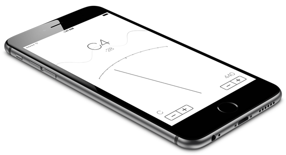
Today we’re proud to introduce our latest creation: TuneWave. First unveiled as part of forScore 8, TuneWave is a no-nonsense tuner that uses a beautiful sine wave animation to give you a visual sense of focus by reducing amplitude as you zero in on your note. You can transpose as needed and adjust the base frequency to fit your needs, and since it’s a universal app, you can use it on any of your devices.

 That’s not all, though, because today we’re also announcing our first App Bundle, the forScore Music Box. It combines each of our accessory apps into one easy package and offers them for just $2.99 (USD, international pricing varies slightly). That means you can get the brand new TuneWave app for free if you’ve already purchased the other three apps individually! Otherwise, TuneWave is 99 cents when purchased separately.
If you haven’t had a chance to check out these apps previously, now’s a great time to do so. From our slick metronome to our recently updated pitch pipe (complete with a ‘today view’ widget for instant access from just about anywhere), it’s a steal. Get TuneWave as part of the new forScore Music Box on the App Store today!
Today we’re happy to announce the immediate availability of forScore 8.1, an incredible update that includes a number of new features, enhancements, and bug fixes.
To start, we’ve added support for iCloud Drive to the Services panel. Due to the way Apple has designed these functions, interactions work differently than they do with other cloud services. Instead of browsing a list of files and uploading or downloading as needed, iCloud Drive interactions are driven by purpose: you begin by choosing to upload or download a file (multiple file operations are not supported by Apple at this time). If you have any apps installed that include a storage provider extension, you can select it within the iCloud Drive interface in the top left-hand corner (called “locations”).
We’ve also made a number of improvements to forScore’s Devices panel, beginning with support for the Adonit Jot Touch and the Wacom Bamboo Fineline. Both of these devices feature hardware buttons, and with forScore 8.1 you can now configure them to invoke any of the common actions found in the “Page turners & shortcuts” section of the settings panel (just like you can currently with the iRig BlueBoard). Not only does it support the Jot Touch’s pair of buttons and the Fineline’s single button, but now also supports the button on the Jot Script.
It doesn’t stop there, though, because we can also detect the difference between a quick click and a longer press and hold (much like forScore’s default annotation shortcut), allowing you to set up two commands per button. That gives you instant access to your top two forScore features with the single-button models, up to four with the Jot Touch, and an incredible twelve on the iRig BlueBoard if you’ve got auxiliary pedals attached.
Finally, we’ve made improvements to drawing accuracy by adjusting our palm rejection algorithms and we’ve added an important new calibration setting to account for differences in handwriting style. Although not perfect, this new setting is the best way we’ve found to account for some severe and complex issues inherent to fine-tipped styli.
Thanks to the hard work of our beta testers and some long nights, we’ve also fixed a number of additional bugs that iOS 8 introduced. We’ve corrected an issue that prevented users from sending some files to other apps, resolved an issue with the Devices panel on the iPad 2, and we’ve greatly improved MIDI connectivity and stability.
Not only that, but forScore 8.1 also happens to be the 100th version of forScore! When we say “free updates for life,” we mean it, so be sure to head over to the App Store today and take advantage of these great new features and important bug fixes (and if you’re on an iPad, be sure to check out our brand new app preview while you’re there, too!)
November 3, 2014
| In Depth, News
In the summer of 2012, over two years ago now, forScore 4 had just hit the App Store and we were beginning to transition forScore over to Core Data. iOS 6 had just been announced, and Apple Maps was gearing up to make waves that still haven’t completely settled down. Since then, we’ve released forScore 5, 6, 7, and now 8, but that’s only half of the story.
This is the story of forScore mini: how we created it, why, and how it reflects the shifts in Apple’s strategy and its priorities. (more…)

