new in forScore 10.410.0
10.1
10.2
10.3
10.4
10.5
A whole new dimension.
There’s no such thing as a finished product. We push forward in restless pursuit of making the best sheet music reader we can, and it starts with knowing where to look: opportunities exist in every direction. Incremental updates aren’t enough when technology moves this fast.
We broaden forScore’s usefulness by expanding its feature set. We elevate content by connecting to the services, sources, and methods you rely on every day. We deepen our app by making it more approachable, easy to get started with and rewarding to master. We make cuts and tough calls to redefine the experience for the next generation. We never stop thinking about where to go next.
Say hello to forScore 10.4, the upgrade that pushes forward in every direction.
Musicnotes
300,000 and Counting
Your experience with forScore is ruled most profoundly by one thing: the quality of your content. Not just the engraving, but the sourcing. A scanned image can realistically mimic paper, creases and all, but truly digital sheet music reproduces its content more faithfully at a fraction of the size. It’s a more perfect, far more efficient copy. To truly experience the raw power of forScore, you need content that flies.
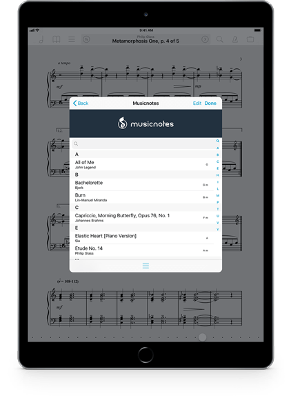
That’s why we’re so proud to be teaming up with Musicnotes.com, the world’s largest digital sheet music provider. They’ve sold over 35 million downloads to over six million customers, and with forScore 10.4 anything you’ve purchased through their site will be available right within our app. No additional fees, no awkward conversions, just your content ready for download as PDFs.
If you’ve ever used forScore’s Services panel to download items you’ll feel right at home adding your Musicnotes content to forScore. Just sign in with your Musicnotes account and your purchases will all be there, ready to download. Since they’re standard PDF files, you can annotate and use them just like you always do. It’s the high-quality, fully licensed music library you’ve been waiting for, coupled with the workflow and toolset you love.
Annotation Layers
Back to the Drawing Board(s)
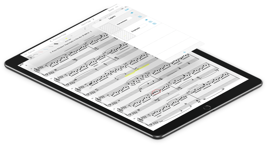
For almost a decade now, forScore’s Snapshots feature has allowed musicians to create and store different sets of annotations for the same page and to swap them out at any time. But since that feature’s introduction iPads have become orders of magnitude more powerful and it’s time to move beyond that simple model. To do that, we’re introducing annotation layers with forScore 10.4 and adding a whole new dimension to the annotation experience.
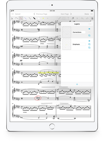
Instead of requiring you to swap out complete, opaque annotation states one at a time like Snapshots does, layers let you group your markings however you like and work with them more flexibly than ever before. Create up to eight layers and reorder them, hide some if you need to, duplicate them, merge them, and more.
We’ve gone to extreme lengths over the past eight years to make page turns as fast as possible, and this new feature doesn’t waste a millisecond of that performance. That’s because your annotations are flattened into a single working copy when you save them, so your iPad doesn’t have to do anything else to put them on screen as you flip through the pages of your score—everything is just as lightning fast as it has always been.
Power
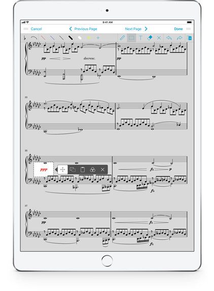
With layers, your markings are divided up into slices that can be edited independently of each other, just like they are in many advanced image editors. That means you can draw on a layer and then erase those markings without affecting any of the contents of your other layers. Switch to another layer at any time and work however and wherever you need to. It’s a whole new way to separate and maintain your markings.
With the selection tool, you can reposition and adjust markings without worrying about those annotations you want to leave as-is. You can even copy and paste markings from one layer into another.
And if you make a mistake, undo/redo support is ready to help. It tracks your edits for all layers so you can step backwards through your changes no matter which layer you were working in at each point. Your undo history lasts longer too, remaining intact until you begin annotating on another page, so you can save your work, flip to the next page, come back again and continue working.
It’s all designed to give you as much freedom as possible, allowing you to clearly delineate between types of markings and to group them by intent, style, or whatever concept suits you best.
Migration
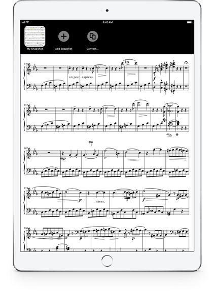
The new Layers panel gives you instant access to all of your markings at once, so there’s no wondering what’s inside each layer like there was with Snapshots. You can toggle visibility for each layer independently and when you exit annotation mode it’s like those hidden layers aren’t even there—until you need them again. It gives you all the power of Snapshots without the cumbersome experience.
In fact, we think layers provide much better solutions to the many different ways people work that we’re replacing the Snapshots feature entirely. If you’ve previously created snapshots for a particular page, you’ll still be able to access the Snapshots interface from within the Layers panel and use them just as you always have, but we’ve added a conversion tool that turns those snapshots into layers so you can keep your work once you’re ready to upgrade.
Since 2010 and forScore 2.2, Snapshots has offered one helpful take on addressing some common needs. It’s tough to challenge such a long-lasting feature and ask users to change how they work, but we know the benefits are worth the effort and we’re sure you’ll agree.
Retrofitting
Dashboard
One of the hardest things we do is tear down and rebuild features that aren’t good enough. It’s not flashy, but we do it because it fulfills the promise we make when we introduce any feature.
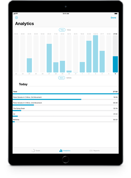
Dashboard is an example of this: it launched with a comprehensive range of utilities, but its logging system suffered from occasional errors and misrepresentations. An analytical tool is only as good as its data, so we completely replaced Dashboard’s logging system to create a whole new foundation for those powerful functions.
It’s not just errors that can warp your perspective, though—sometimes legitimate data isn’t helpful—so we’ve added the ability to reset some of the information collected by Dashboard. Swipe to delete all data tracked for an item on a specific day, or reset the whole day and start fresh. New settings in the Analytics tab allow you to control whether Dashboard collects data while you annotate, and adds the ability to pause tracking at any time (configurable with gestures in forScore’s settings panel).
All this and an updated design that feels right at home on iOS 11 gives Dashboard the new beginning it truly deserves, and we think that a second look might just turn into a double-take.
Rearrange
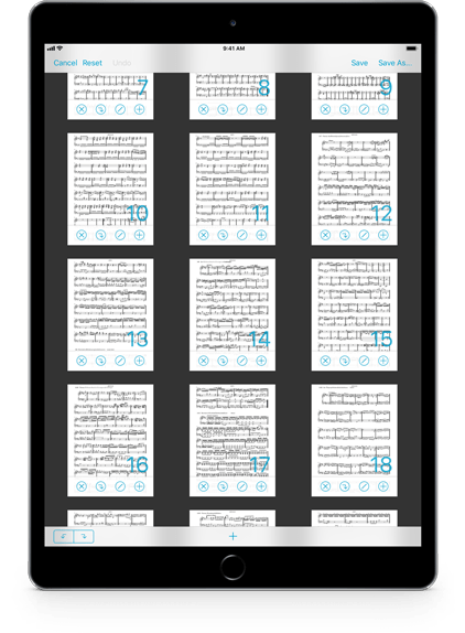
One of forScore’s most powerful features is the Rearrange panel that allows musicians to reorder, duplicate, insert, rotate, and remove pages of their PDFs to fix structural issues or create a whole new layout that handles repeats more intelligently. It’s incredibly complex and we’ve worked hard over the years to make it as efficient and usable as possible without stunting its capabilities.
Since Rearrange moves pages around, though, the process of saving has required removing all bookmarks and links. Now, any links whose source and target pages haven’t been removed will be preserved and adjusted to account for your new layout.
Rearrange now also preserves bookmarks as well, if possible. As long as the start and end pages still exist in your new layout, and haven’t been inverted (a bookmark can’t start on page 5 and end on page 3), they’re now updated to account for your changes.
Whether you’re doing major reconstruction or inserting a missing page, you no longer have to sacrifice the work you’ve done to create links and bookmarks. Tricky to implement, easy to explain, and obvious to use.
Services
The Services panel lets you access and share your files easily through a consistent, unified interface for many different cloud storage services. Not all of these services offer the same capabilities, though, so we’re adding new service-specific features to help you work more efficiently.
If you use Dropbox or Box, you can now specify a starting folder that will be visible when you open the Services panel. If you leave for a short time and come back your last-viewed directory will be preserved, otherwise you’ll return to that saved directory instead.
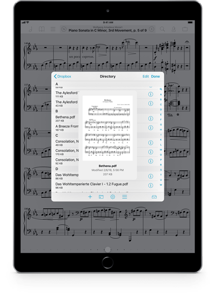
With Dropbox, you can now preview certain types of items before downloading them. The Services panel shows a thumbnail image of PDF, text, or image files along with basic information like filename, size, and modified date. It’s a great way to make sure you’ve got the right file before you download it into your library.
And finally, the iCloud Drive service is now “Files” on iOS 11 and supports third-party File Providers so you can access dozens of new sources. You can now also upload or download multiple files at once, making this Apple-provided interface infinitely more useful.
Act Two
Approachability
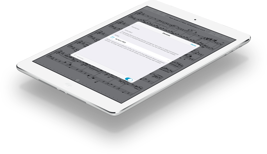
We spend a lot of time thinking about how and where to add new features. Tools must be obvious and accessible when you need them, but can be overwhelming if they’re all presented at once or made available in the wrong context. We have always tried to organize our tools into a hierarchy that opens up complexity through a process of steps rather than shoving buttons into every corner.
No matter how clearly we structure our tools, though, there’s no escaping the fact that forScore is leagues beyond the single-function utilities many of us are accustomed to using. To help newcomers we’ve added more guidance to forScore 10.4 that gives people a brief explanation of what a feature does if they need it. These explanations are available without being obtrusive or condescending to our experienced users, and we think this information will ensure that no one feels overwhelmed or disregards features prematurely. We think a little bit of guidance will go a long way to showing new users that forScore can be robust and feature-rich without being inscrutable.
Evolution
The Bluetooth sharing panel was built with iOS 4 on top of Game Center APIs before AirDrop was a feature anyone had ever heard of. Every device since iPad 2 supports AirPlay mirroring, leaving forScore’s legacy TV Output features in the dust. Annotation layers offer all the flexibility of the Snapshots feature they replace, and add so much more. The WebDAV and FTP standards are collapsing in the face of modern threats and security shifts.
What made sense at the beginning of this decade doesn’t always hold up as we come to its close. These features are undoubtedly helpful for some, but they get in the way for new users and unnecessarily complicate the experience of getting started with forScore. So with forScore 10.4 we’ve begun the slow process of deprecating and eventually removing them. It’s a tough call to make, but it helps us re-align and offer the best possible experience for all of the musicians who are just beginning to move to digital sheet music. After all, you shouldn’t need to know forScore’s history to understand its use.
Automation
Creators
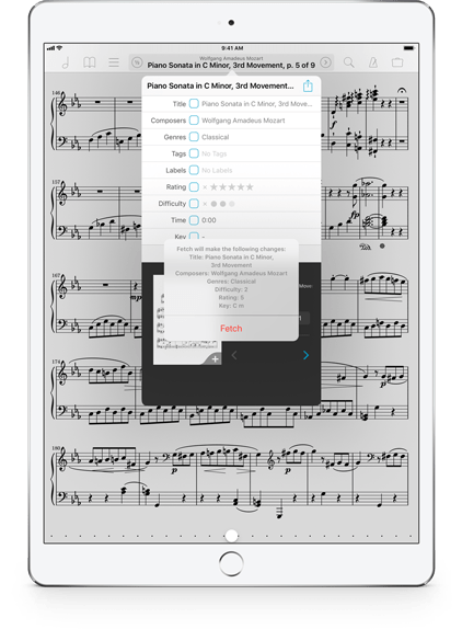
The PDF specification supports certain kinds of metadata, but they’re not designed for sheet music. Since version 1.6 forScore has had the ability to import these generic values and has used two app-specific keywords to convey rating and difficulty.
These accommodations have been helpful but we’ve long wished for a more formal way of storing this data. If you’re going to the trouble to embed this data into your PDF files, after all, it should be as universal as possible. With 10.4 we’re making these special keys more generic, adding some new ones, and we’re publishing a guide for users and developers to standardize how they’re represented.
We can only control how forScore works, but we hope this encourages a new era of collaboration and flexibility that helps users share unabridged content between apps and platforms.
Tinkerers
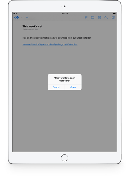
Most people see “URL” and think “web browser,” but there’s a lot more to them than that. They’re a powerful tool that can be used to direct apps to specific content or views, and we’re adding a few of these automation capabilities to forScore with version 10.4.
By using a special scheme and formatting your links in certain ways, you can tap a link anywhere on your device—in Safari, Mail, or any other app—and open forScore to a particular score, bookmark or setlist. Or, you can open the Services panel to a specific directory (helpful for groups that make their updated scores available to their other band members).
That’s where we’re starting, but there are many other ways we hope to weave automation into forScore in the future. It’s the start of some amazing and convenient capabilities, and we can’t wait to see what you do with them.
Developers
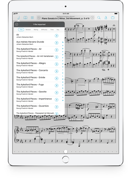
When iOS developers make files available to other apps through the system’s standard document sharing interface, they can choose to pass additional information along with that file if appropriate. With forScore 10.4, we’ll begin looking for certain types of information and, if present, adopting them as forScore metadata.
Action Extensions allow developers to provide focused, content-based functionality to users without requiring them to switch apps or copy data back and forth unnecessarily. Now, if the user allows it, an app extension can provide in-place editing of their forScore content. It’s an incredible opportunity for apps to offer editing capabilities that are beyond forScore’s scope as a music reader.
If you’re an iOS app developer, check out the documentation to see if these new capabilities could be appropriate for your app. If you’re not a developer, but you use apps that you think could take advantage of these features, encourage them to take a look.
More
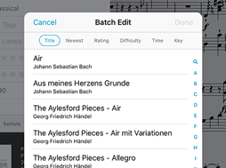
Pickers
Item pickers can now sort their contents by title, newest, rating, difficulty, key, or duration so you can find things quickly.
Preview scores and bookmarks with Quick Peek when selecting them from item pickers like the batch editing picker.
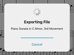
Sharing
If sharing a file requires exporting it first, you’ll now see a progress indicator appear so you can see how long it will take.
4SC and 4SS files are dramatically smaller than those made with older versions. Smaller means faster, and we like faster.
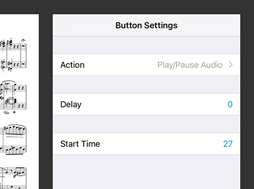
Buttons
Play/Pause buttons now let you specify an optional start time, so you can seek and start playing with just one tap.
New buttons let you open items, URLs, or seek to a specific point in the current track whether it’s paused or playing.
Available now.
forScore 10.4 and all of these amazing upgrades are available now, absolutely free for all existing users. Get it today on the App Store, and be sure to check out our news page or use our RSS feed to follow our latest news and announcements.