We’re taking a break from this column to work on our next big thing, but there are almost two hundred features here to catch up on if you haven’t read them all. If there’s a topic you’re interested in, you can also try searching for it.
If you’ve used setlists before, you probably know all about how to add, remove, and rearrange the items within them. There’s another way of changing things, though, and it’s in the Metadata panel.
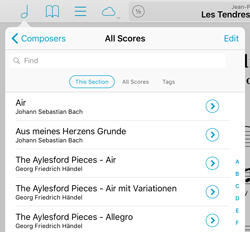
Tap the circled arrow next to any item in a menu or tap the title of the current piece in the main view to see the metadata panel. In the lower section, the “Setlists” tab shows all of your setlists and a check mark next to the ones that your item is a part of. Tap a checked setlist to remove the item from it, or tap an unchecked setlist to add it. You’ll probably want to still go into the Setlists menu and rearrange items once you’ve added them, but this view gives you a way to see a quick overview or to add a new piece to a few different setlists easily.
February 26, 2016
| Feature of the Week
Last week we discussed Snapshots, a way of saving the annotations on a page and restoring them later. That works well for certain situations, but only annotations are saved and on a page-by-page basis. For changes that affect an entire piece, Versions is the tool for the job.
Versions lets you save and restore all of a score’s metadata and annotations at once. A teacher, for instance, might want to use the same PDF file for several different students but with personalized annotations and recordings. Select “Versions” from the Tools menu to get started—the interface looks similar to the Snapshots feature, so if you followed along last week creating and browsing through a score’s versions should feel familiar.
Unlike Snapshots, which simply copy your annotations back and forth as they’re saved and restored, Versions introduces the idea of a “current” version. When you create or restore a version, an arrow will appear next to it. It won’t be updated automatically as you make changes to your score, but the next time you switch to a different version or create a new one, you’ll be prompted to save those changes to the current version first. You can also select the current version and manually save it at any time.
So next time you find yourself duplicating files and renaming them to tell them apart, save some space and remember to use the Versions tool instead!
February 19, 2016
| Feature of the Week
Context is important, and the annotations you make today may not be useful in another situation. Instead of constantly erasing everything and starting from scratch, forScore’s Snapshots tool lets you save and restore all of the annotations on a page, including your drawings, stamps, shapes, links, buttons, and text annotations.
While in annotation mode, tap the clock icon (the last tool in the lower row of controls) to see the Snapshots interface. Tap the “Add Snapshot” button and give it a name, and all of the annotations you’ve made—even if you haven’t saved them yet—will be copied and displayed in a row along the top of the screen. Tap on it to see a preview, rename it, delete or restore it.
Now you can continue annotating, or erase everything and start over, saving as many new sets of annotations as you like. To reset the page back to a saved state, simply tap on the snapshot you want to use and tap the “Restore Snapshot” button to replace all of the annotations on the page with that snapshot.
So whether you’re maintaining separate annotations for practice vs. performance or you’re a teacher with multiple students, snapshots can save you time and let you work more flexibly.
February 12, 2016
| Feature of the Week
Back when the iPad was first introduced, there were a few key things from a software standpoint that really made it feel like a completely new thing: the photos app with its unique interface and gestures, the mail app’s split screen layout, and of course iBooks with its unbelievable page curl animation.
Every version of forScore has used this same animation when moving between pages, and although it’s not the head-turning detail that it once was it still fits well with the page turning concept. Unfortunately, it’s a system-provided animation and can’t be customized, so it always curls up from the bottom right-hand corner of the screen up to the top left. That means the most important part of the next page is the last part of the page to come into view. We’ve sped up the animations a lot since version 1.0 to help, but if they just don’t work for you we’ve since added three other options: stack, slide, and no animation at all. (Tap the “Page Transitions” option in the settings panel to try them out for yourself.)
The “Stack” option animates the top page only, throwing it off to the left and revealing the static next page beneath it. The “Slide” option moves the current page off to the left while moving the next page in from the right, like camera film advancing. Both animations work in reverse when you navigate to the previous page.
The “Off” option removes animations altogether, making your page turns virtually instantaneous. For some, the lack of animation makes it difficult to see if you’ve actually advanced to the next page or not, but for others it’s perfect. Try them all out and find the one that works for you!
February 5, 2016
| Feature of the Week
Sometimes one song is enough, but when you’re playing through several different pieces you’ll want to know about Up Next. By default, when you select a song from a Setlist, you’ll be able to turn pages not just within that song, but also between all of the songs in that setlist—so turning past the last page of one song takes you to the first page of the next.
When you get to the last page of a score and you’re not already at the end of your list, Up Next lets you see what’s coming up before you actually turn the page. It’s a small notification that slides down over your device’s status bar (where you can see things like the current time or battery level) and shows the name of the next piece in the queue. There’s also a small gear icon on the right-hand side that lets you customize how long this notification appears: for four seconds, ten seconds, indefinitely, or never.
January 29, 2016
| Feature of the Week
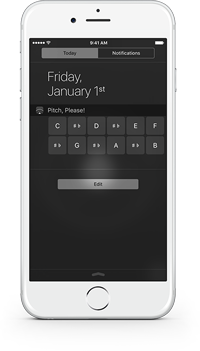
On iOS devices, swiping down from the very top of the screen lets you access a dark panel called Notification Center. Like its name suggests, it gives you quick access to all of your device’s notifications, but it also has another view called the “Today View” that lets you see all sorts of bite-sized pieces of information. With a quick glance, you can view your upcoming calendar events, check the local weather forecast, monitor traffic conditions, and more.
 These chunks of information are called widgets, and you can pick the ones you want to see and rearrange them to suit your needs. Some of them are built-in, but developers can also create their own widgets and include them with their apps for free. To use one of these widgets, just tap the “Edit” button at the bottom of the “Today” view and then tap the green plus button next the one you want to see.
A pitch pipe widget is included with forScore, forScore mini, and Pitch, Please! (our standalone pitch pipe app). Once you’ve set it up, you can tap any of the note buttons to hear a pitch in whichever octave and instrument you last used within the app itself. It’s quick and easy, so if you find yourself needing a pitch pipe regularly be sure to check it out!
January 22, 2016
| Feature of the Week
Coordination is a key part of music. The balancing of different notes and instruments produces something greater than each individual element, but good timing is essential. Effective harmony relies on tight synchronization.
Cue, forScore’s wireless navigation system, allows users to automatically coordinate page turns and program changes so everyone is literally on the same page. When using Cue, one person assumes the “leader” role, changing songs and turning pages just as they normally would. Other users can assume the “follower” role, and their copy of forScore will automatically follow along.
To use Cue, select “Cue” from the tools menu or tap the circled Cue icon in forScore’s title bar. Choose to lead your group, or choose one of three follower options: Follow Page Turns will flip forwards and backwards, use half-page turns if needed, and scroll up or down in landscape orientation. Follow Program Changes allows the leader to select a song to play, but leaves page turns up to you. Follow Both allows the leader to control both simultaneously.
For groups that use different but similar parts, following page turns only is a great solution. Everyone can choose their own version of music, but overall page turns are still kept in sync. For other groups, following program changes is especially helpful because not only can the leader direct everyone to the right piece at the same time, they’re also immediately notified if a follower doesn’t have the file on their iPad. If the leader chooses, they can send a copy wirelessly to anyone who needs it in seconds.
Cue uses an Apple framework that combines the power of Bluetooth and Wi-Fi to send commands as quickly as possible. It works with forScore for iPad and forScore mini for iPhone or iPod Touch. There’s even a standalone Cue app that works more like a remote control, allowing someone to read along with you and discreetly turn pages without hovering.
January 15, 2016
| Feature of the Week
In an ideal world, each of the PDF files in your digital music collection will represent a single score. Metadata like composers, genres, tags, and labels let you organize those files into more abstract collections (like which publication it comes from) without losing the flexibility of having individual scores in your library.
Thanks to centuries of publication standards, however, you’re bound (pun intended) to come across a PDF that’s either scanned from or published digitally as an exact copy of a larger collection. If you can’t or don’t want to split those scores into individual pieces, bookmarks are the next best thing.
Bookmarks in forScore actually come in two different flavors: a single reference to a particular page that works just like you’d expect, and a more advanced type of bookmark that lets you take a set of pages from one file and turn them into a new, virtual item in your library.
Simple bookmarks let you name a page so it’s easier to find. These bookmarks are only visible in the bookmarks menu while you’re viewing that particular file, and they don’t do anything beyond that.
With forScore’s more advanced bookmarks, you can essentially turn a set of pages from one file into a new item in your library. It doesn’t actually create a new PDF file, so it takes up virtually no space at all, and it opens up a whole range of possibilities: these bookmarks have their own metadata, they can be added to setlists, and they can even be turned into a completely separate file and shared with colleagues if needed. These bookmarks also show up in the scores menu, so they’re easy to find independently of their source PDF file.
One last bonus feature: if your PDF file has an embedded table of contents, you can use this information as is (like simple bookmarks—names that reference a single page), or you can use it as a starting point to create a full set of advanced bookmarks as well. Check out page 9 of forScore’s user guide for complete details.
When you want to browse your collection and look for something to play, forScore’s main menu and a well-tagged music collection are perfect. Other times you know exactly what you need and just want to get to it as quickly as possible. In this case, the Search panel is the best solution (it not only lets you find a particular piece quickly, but also allows you to find any setlist, category, and even most of forScore’s actions and tools by name).
But sometimes you need a little bit of both. You may not remember the exact name of a piece, but you know generally where to look for it. For this, most of forScore’s menus include a search bar so you can filter its list of items even further based on title, composers, or tags.  When you open a menu, this search bar will be hidden by default, but drag the list downward and you’ll see it slide out from the top.
These search bars aren’t just in the main menu, they’re almost everywhere you can find a list of scores. That includes the setlist editor, the upload picker in the services panel, and the metadata panel’s batch edit picker. So the next time you’re looking at a long list and you know the item you need for is somewhere below, save yourself some scrolling and get to it with just a few taps.
2016 is here, and today lots of people are starting things out right by rededicating themselves to those habits that are important but hard to form. Like backing up your files.
If you’ve spent time scanning, organizing, and annotating your scores, then you should also know how to back them up—and you should do so regularly! We recommend backing up before any update to iOS or major update to forScore, and especially if you’ve made a lot of recent changes to your library. Our knowledge base article on the subject includes detailed instructions on how to back up your files:
Backing up your data to your computer
For those who got their hands on a shiny new iPad this holiday season, the instructions for transferring your library are similar. Of course, the best way to move everything to a new iPad is to restore it from an iTunes or iCloud backup. If that’s not possible, or if something goes wrong, it’s easy to move these files over manually. Here’s how:
Transferring your forScore library to another device
Don’t risk losing all of your hard work this year, back up regularly and turn a good practice into a smart habit. Happy new year!
 These chunks of information are called widgets, and you can pick the ones you want to see and rearrange them to suit your needs. Some of them are built-in, but developers can also create their own widgets and include them with their apps for free. To use one of these widgets, just tap the “Edit” button at the bottom of the “Today” view and then tap the green plus button next the one you want to see.